Typophile

Double-checking

50pointtype

Hi all.
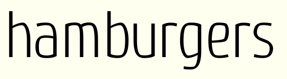
Before I get too deep into this design, I want to run this past everyone to see if it resembles any existing typeface. I'd hate to put in a ton of effort to hear someone say "you know that looks like a knock-off of XXX Roman" etc. I like where it's going, but you know, I want to make sure.

And if you have any initial comments, have at it. But keep in mind I haven't yet touched the spacing/kerning.
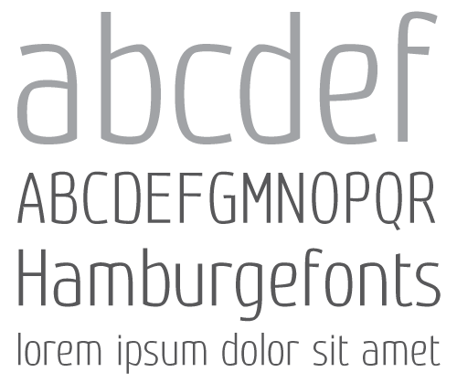
Thanks.

Looking good! I don't know anything that looks like this. There's just one thing that bothers me. I used to make the same mistake and I see it in a lot of starting typefaces.

check: http://www.typeworkshop.com/index.php?id1=type-basics
the article 'Balance Shapes' is what I'm talking about, but it's a very good website in general.

Yanone’s Kaffeesatz (refurbished for commercial release as FF Kava) is another condensed spurless sans-serif with a pinch of quirkiness – but I don’t think your design is terribly close.

This is nice. I like how the quirkiness becomes pronounced at display sizes but subdued the closer you get to a text size.

Thanks guys. I'll make sure to post the progression of this thing.

1996type: What's the one thing? I'm pretty sure the B and r have the right adjustments.

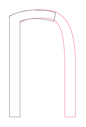
Did you already adjest it, but your not sure weather you did it properly. Your B doens't need adjestment. It's fine. But an r needs more whitespace at the than an n. You just made a chopped of n which is bad for readability and (my opinion) looks unbalanced.

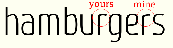
The "r" was already adjusted but a little more per your comments. (See below) This "spurless" design presents its own little problems, like we have here. No matter what you do it's going to look somewhat like you've just cut the leg off an "n."

No, you don't get what I mean. Here's a picture to clarify. I'm not a pro and it's still your typeface, but I think this looks better. Hope you agree. Could you have a look at my 'expletus sans' and 'expletus text' posts please?

I appreciate your critique but I'm not completely sold on that way of doing it. I agree that yours does look more balanced as a singular letter but it creates a shape that doesn't appear in any of the other letters that run along the x-height.

I could be persuaded though. Any other opinions out there?

Galen,

I think your "r" looks better in the context of the other letters. I'm wondering if it should be a bit wider?

Captured from web.archive.org on 14 Apr 2015. view this capture