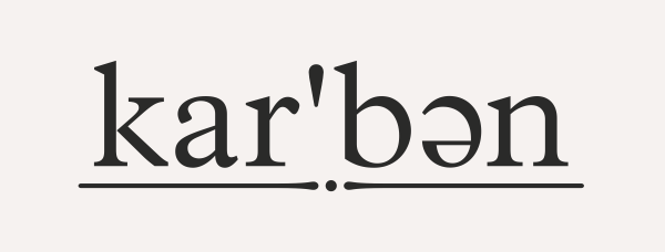
At the risk of merely kicking myself for not having done this sooner, I'd like to offer this restaurant logo for critique. The project is already complete, and I'd neglected to seek feedback along the way, so try not to be too harsh.
The name and grammar had already been set in stone - nothing I could do about that - the job was to set it in type and add any additional elements I felt were appropriate or necessary. The underscore and dot are a hint at a morse-code 'k' as the owner's name also begins with that letter (and it's their first business venture) so I wanted to make a reference that may hold some personal significance.
I'm about to press 'Save' with trepidation...
| Attachment | Size |
|---|---|
| logo_final.gif | 6.86 KB |