Typophile

Examples of using Compacta

Martin Hoyem

Hi guys,
I am new to this forum, but I have been reading and learning as an anonymous visitor for quite a while. Thank you, guys, for letting your awesome expertise be available to dilettantes like me!

Here's my first question:

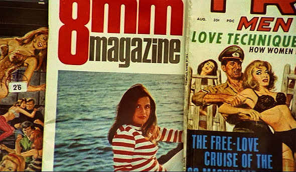
Do any of you know any good examples of the use of Compacta. I recently used it for a project, after having researched which font to use for a few months, and can't entirely stop. Here's what triggered my use of the font, a cover I spotted while the camera trucked over a magazine rack in Jean-Luc Godard's "Sympathy for the Devil" (1968).
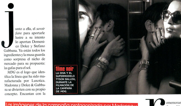
I also recently came over the Latinoamérica edition of Vogue, which uses Compacta for some caption headings. (June 2010)


Thanks, guys! I just realized I had this book laying around. It looks like Compacta, too, right?

And then there's this book cover from 1965. The words "Sexual Fetish" is, I believe, Compacta.

(By the way, the "Coming of Age In Samoa" book cover above is from 1963, so it seems they put that typeface to work right away! As far as I'm able to research it, the typeface is from the same year.)

I wonder if anybody has any more info (more than the little I can find online,) on the typeface designer Fred Lambert, and the original Letraset font.

Here I used Compacta on a logo for my community's opposition to a City Jail site next to our hood, shown here as a letterhead.

Captured from web.archive.org on 13 Oct 2013. view this capture