
Hello everybody,
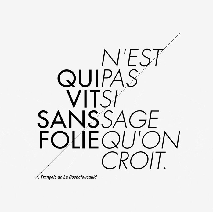
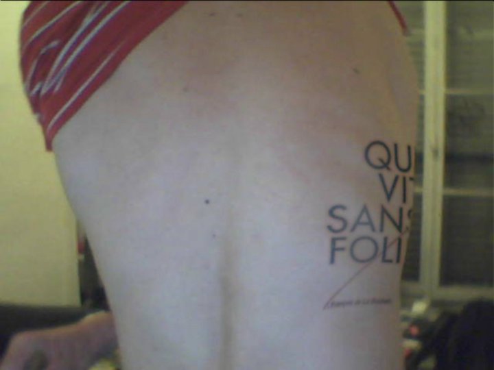
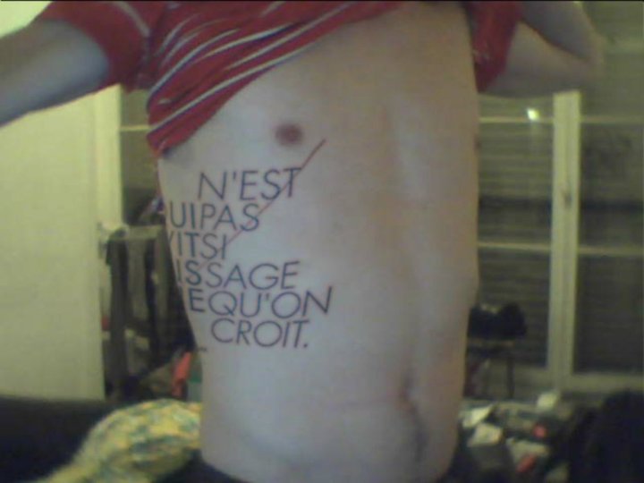
I'm new here, i'm french and i would like your opinion about my future futura tatoo i'm planning to have in few month !
Do you have any ideas to make it better ? Do you like it ?
Thank you for your contribution :)

Hello everybody,
I'm new here, i'm french and i would like your opinion about my future futura tatoo i'm planning to have in few month !
Do you have any ideas to make it better ? Do you like it ?
Thank you for your contribution :)

I would recommend hiring a professional designer to assist with the typography and spacing. I would also try to find a tattoo artist able to follow precise specifications, and follow up with references to customers who received similar work.
There's a probleme whith the typography and spacing ?
I'm not sure to understand, I'm not realy good in english
but thank you for your response :)

try not to ever gain any weight
Héhé !! I'will post in few years the "bold" version of my body !
But that's a photoshop manipulation for the moment.
Please give your opinion before i do it for real, type experts like you have certainly a lot of adjustment advices.
>There's a probleme whith the typography and spacing ?
Yep, I think the spacing "PAS" and "SAGE" could use some work (PA and SA combinations too tight), also to my eye the italic Q and S's looks distorted - is this the true italic?
Thank you very much sii, i will make those corrections (now you tell me it's clearly jumping to my eyes).
Yes it's the true one but maybe my futura font is not a good one, i'll check the points tonight.
I will certainly play with the diagonal too !
You haven't tell me if you like the idea, the sentence means : who's living without crazyness is not as wise as we think.
What do you think ?

My French isn't quite up to a translation! Any chance you can post its meaning in english - it would make it much easier to judge its effectiveness.

My question deals with the 45° line through the text. I see it so often in "current" design, yet I have no idea where it comes from. It's as if the designer has a block of text and thinks "I've got to jazz this up somehow . . . I know! I'll put a line through it!" Is there a reason for the line being there — other than style — that I'm missing?

Except from the fact, that it looks like you have slept on a staining grocery bag, there is a disharmony between the tattoo and your body. It is not only the constructed Futura on a shifting skin, but also the big text size. It really looks plumb.
I like well made tattoos. But I can hardly imagine, that one is not having regrets about a tattoo like yours later.
And with regard to the 45° line, I absolutely agree with Penn.

My question deals with the 45° line through the text. I see it so often in "current" design, yet I have no idea where it comes from. It's as if the designer has a block of text and thinks "I've got to jazz this up somehow . . . I know! I'll put a line through it!" Is there a reason for the line being there — other than style — that I'm missing?
Except from the fact, that it looks like you have slept on a staining grocery bag, there is a disharmony between the tattoo and your body. It is not only the constructed Futura on a shifting skin, but also the big text size. It really looks plumb.
Exactly my thoughts.
This "tattoo" doesn't really make any sense to me.

IMO, the diagonal line will date quickly, but the layout and type choice is good and classic, so will last well.
I would also suggest using "proper" apostrophes, and dropping the period before the name.

IMO, the diagonal line will date quickly, but the layout and type choice is good and classic, so will last well.
I agree with Nick. (I like the quote, too.)
Just be aware that it is tempting fate/life to get large, light, geometric letters tattooed on a uh, morphable area of the body. It makes for a very nice texture; but make sure you're comfortable with the fact that even if you don't gain weight, it won't always look like it does in your nice mockups but will sag and wrinkle. Skin gets old and looser, and tattoos get lighter and blurrier. If you're fine with that, good.
That said, I would consider making the name bigger, and/or looser (in terms of spacing). In the layout it looks good in terms of proportion, but it might just be too small/dense/detailed for skin.
Also, please get a tattoo artist who really knows what they're doing.

I don't think a geometric typeface is a good choice on this part of the body. Keep in mind that your belly will change over the years, it's kind of unavoidable. And a distorted Futura will look horrible. Plus, it's really, very hard to make perfect rounds with such thin lines on skin, and there is always a possibility for the ink to spread a little... Consider choosing a typeface that will aesthetically handle this kind of problem. Also, the quote says that wise people are also a little crazy - imho, Futura is really not the best choice for the idea. At last, the line seem pointless and 80's, and the name of the author is, again imho, useless.
... mais bon, ceci etant dit, c'est ton corps, hein... bon courage a toi et au tatoueur.
david
@ Nick and Nina
Lol! Whatever you will write in future, I will not blindly trust in the dependability of your trained eyes anymore.
I've been pondering about getting a type tattoo for a while as well and I'd just like to point out that tattooing isn't a very exact art-form. The little details that make the letterform can easily disappear, no matter how experienced and/or talented the tattoo artist might be. Skin stretches and while the letters might look good with your arm in a certain position, it will probably look (very) warped when you move around. Also the above mentioned blurring of tattoos may cause problems, especially with such thin lines.
Type tattoos can be cool, but it's important to keep in mind that tattoo artists are not typographers and skin isn't a piece of paper. A tattoo can never be a perfect copy of your design and vector-sharp edges will blur with time. When I was designing my own tattoo, I had some unrealistic expectations on how the result should turn out. After talking to various tattoo artists, I came to accept the fact that I can't have complete control over the tattooing process. One of the studios I visited actually had a sign on the front door stating that they won't make tattoos for graphic designers – I don't know exactly why, but I think it has something to do with the fact that perfectionists and control-freaks are notoriously hard to work with ;)
Just my two cent's worth.
I don't think a geometric typeface is a good choice on this part of the body.
Going smaller with everything will help things on this front. I'd also increase the pt. size of the name as it could easily turn to an unreadable blob at that size, weight and tracking.
penn
Captured from web.archive.org on 20 Oct 2013. view this capture