Typophile

Long s code

Nick Shinn

Although the "hist" feature is not presently supported by any layout applications, I am putting it in all my new fonts, along with longs.

sub s by longs;
sub longs' f by s;
sub longs longs' by s;
sub f longs' by s;
ignore sub longs' @letter;
sub longs' by s;

This satisfies all the circumstances listed by Andrew West, except the Genesis abbreviation, of course.

I haven't developed codes for other languages.

It would be cool to be able to apply this feature to e-books, especially those written in the longs days.

nb. "@letter" is a class comprising all letters other than "s". The "ignore" command is a clever way to handle substitutions at the end of words.

> Although the "hist" feature is not presently supported by any layout applications

...except all those that use Mac OS X’s native text engines with access to the system Fonts palette, such as Apple Pages or Pagehand, as well as TeXWorks/XeTeX and some others.

Ah ha! What other features do they support that InDesign &c. don't?

the German practice of using short s medially at the end of the elements of a compound word (e.g. misverſtants, Rechtsgeleerden, wisconſtige, Straatsburg, Godsdienſten, misgaan, boosheyt, dusdonig and misbruyk).

Am I right, that this cannot be solved without a dictionary in the feature code? Alternatively a rule like this could help:

sub longs exclam' @letter by sindicator;
sub longs sindicator by s;

Exceptions for the 17th and 18th century are likewise problematic.

It is a bit comparable with the different rules for the Latin figures. The feature in P22 Operina (?) does not match all rules and exceptions. (Nevertheless it is a cool feature.)

I think, that fonts, that contain those features, require a manual with the typographical rules and a warning, that the user should not blindly trust in certain features.

Nick, InDesign supports 'hist' feature, although it is hidden. Choose Edit > Keyboard Shortcuts, then select the list of keys for the panels. There is a list of shortcuts named Characters:OpenType. And there is a possibility to add a keyboard shortcut for historical variants of glyphs. You can't access this feature through menu, only via keyboard. An easier way to access the feature is to use free plugin Keyboard Shortcuts by DTP Tools (http://www.dtptools.com/product.asp?id=ksin) - you can type the word "hist" to the search window to quickly find the correct function.

Hm - it might be a good idea to exclude languages other than English from your code Nick, in which it might just do more harm than good.
In fact I'm not sure it's a great idea to have code for English but not other languages (and in some languages, like German, I'd say it's not possible to code this without a dictionary); also in terms of what people expect to happen… like Arno said, it would at least warrant a manual with instructions.

[Edit: Sorry about re-editing after re-reading, it's a bit hot today.]

BTW German Wikipedia has a little overview on long s usage in different languages – though not as comprehensive as the one Nick linked to:
http://de.wikipedia.org/wiki/Langes_S#Regeln_zur_Verwendung_von_langem_....

Arno, where did you get that list of German words from? They look more like 18th century Dutch to me!

Filip: Great find! It seems ID still has a few hidden features (I was equally surprised to read this post).

I don't think there's a problem with having English-only features, Nina, I have included a German-only feature, lowered dieresis, in several fonts.

Filip, that's very clever, but perhaps it's best to include this "historical" feature as a Stylistic Set, although that would still be no guarantee it wouldn't be misused by unsuspecting Germans.

Anyone who wanted to use it "seriously" would be prepared to edit it accordingly, and those who like the gimmick effect without too much stricture would be happy to settle for the one "late model" convention it presents, which is pretty standard, IMO, for English.

It's true that the conventions regarding long s vary, even in English, but why should that mitigate against such a feature?
After all, layout application "smart quotes" f*ck up apostrophes at the beginning of words, and there are no warnings about that.

TdJ, thanks for the link!

@ Theunis

It is from the website, to which Nick has linked in his first post. And yes, it is not German. Rechtsgelehrte, Gottesdienste, Bosheit (?) – that’s German. The principle was clear. But as far as I interpret the rules from the Wikipedia article correctly: Miſſverständnis, but not Missverständnis, because ſſ is a diagraph in that word. (I am not sure. I have to check that again. Maybe Miſsverständnis is correct. Yes, I think Miſsverständnis is correct, but Miſsetat is wrong. Miſſetat is correct, because the first part of the word does not end in a s.)

A German dictionary, in which the longs is used, would be nice to have. Does such a dictionary exist?

I just found a thread regarding to the programming of the hist feature (in German) on typografie.info: .

Even in Arno Pro a ſſt-ligature is missing. Or isn’t "gewuſſt" correct? I assume, that there are much more opportunities in German to use an ſſt-ligature than an fft-ligature. If I am using the longs, I also want to use ſ-ligatures, wherever it is according to the rules, because the long s drags more attention to the letters (and therefore it probably is not useful for the most readers, but more a gimmick, as Nick already has insinuated.)

I assume, that German is the only language, for which it is impossible to program a hist feature, in which you can trust.

Even in Arno Pro a ſſt-ligature is missing. Or isn’t "gewuſſt" correct?

I guess that depends on your opinion about if German reformed orthography can go together with the usage of ſ: Mißverſtändnis, gewußt (pre-reform orthography).

I assume, that German is the only language, for which it is impossible to program a hist feature, in which you can trust.

If you follow the spec, the hist feature isn't meant to be context-sensitive:

http://www.microsoft.com/typography/otspec/features_fj.htm#hist

Juan Pascoe, a great printer and researcher settled in Mexico, has just told me via e-mail that, in his opinion, in Spanish some complicated uses had to do with the lack of some characters: for example, he says that the ſb ligature was not common, so if you had to write about Liſboa (Lisbon) the space between these two characters was too wide, so you used a short s instead. The same goes for something like “ilustriſſimo”: the ſſi ligature was pretty rare, so you can only use the best available combination: “ilustriſsimo”.

Theunis: Thanks for the link, it is very useful!

...in Spanish some complicated uses had to do with the lack of some characters...

Typographic aesthetics over-ruling orthography.
I like it.

Nick,

> Typographic aesthetics over-ruling orthography.

this has been happening quite often. My favourite example is the Polish ą and ę. First, there was the Latin “e caudata”, which was used as an alternative graphic form of the Latin vowel “æ”:

http://www.flickr.com/photos/adamt/3630379481/

As it was present in typefaces that were imported to Poland, typesetters adopted the glyph to be used as the graphic representation of the Polish “nasal e”. The other nasalized vowel (“nasal a”) was represented as an “a” with a thin, simple stroke — which did not at all look like the “ogonek” in “e caudata”. Look at the “ą” and “ę” in:
http://www.flickr.com/photos/adamt/3630378529/
http://www.flickr.com/photos/adamt/3630381453/

Only some time later, the typographic æsthetics “ruled” that those two forms should be “made alike”, and the more sophisticated, mature one (i.e. “e caudata”) has been chosen as the source.

Adam

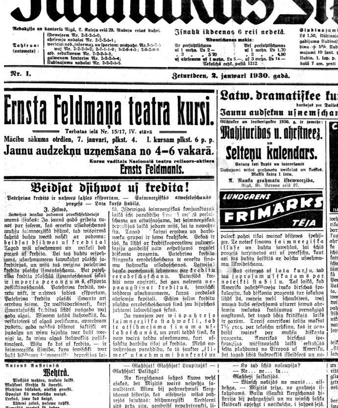
In Latvian long s was used for the sound of "z" so it could end the word. For the sound of "s" in the middle of the word was long s with a slash except for ligature st. Also there was capital S and capital Sslash.


as you may see two orthographic rules in one page - ones for blackletter, the others for Latin letters.

@ Christobal

[…] for example, he says that the ſb ligature was not common, so if you had to write about Liſboa (Lisbon) the space between these two characters was too wide, so you used a short s instead.

Not common means, that it wasn’t available for most typefaces?

@ Nick

Typographic aesthetics over-ruling orthography.
I like it.

But if the ligature is present in the font, you don’t have the problem with the big space, as far as the ligature is well made.

Unfortunately most fonts are very incomplete with regard to the ſ-ligatures, although it would not require much efforts to create them, if the f-ligatures are already present. In most fonts ſ and f are almost identically with regard to the shape. If you have a ſ followed by a ſt-ligature in the German word "gewuſſt", this looks very ugly and inconsequent in many typefaces. Either no ligature or an ſſt-ligature or the Eszett (ß). Is it somehow contradictory to make use of the longs and to follow the reformed German orthographic rules?

I assume, that there are no or almost no German words, in which you could use a ſſb-ligature, but the ſſt-ligature could be used very often in German (in contradiction to the fft-ligature). And it would not cost the typedesigner much efforts to add all these ſ-ligatures to fonts.

(I just had a look on the features of [the genial] Williams Caslon. The font contains a horizontally shortened alternate f. [More fonts should contain a shortened f! Typedesigners forget the accented letters, that are used in combination with the f, too often.] I don’t know, whether it also contains a shortened ſ, but it should.)

Somehow I felt in love with the ſ. It invites to puns.

@Arno: Yes, I meant that in the vast majority of cases it was not available. Or at least it wasn’t used – presumedly because they didn’t have such ligature. Old printing in Spanish-speaking countries often had very limited resources. BTW, Juan Pascoe just told me that if we are looking for rules for ſ in Spanish, we may have a better chance by studying some well-chosen manuscripts (i. e., written with care by professionals), since they didn’t have to worry about lack of characters.

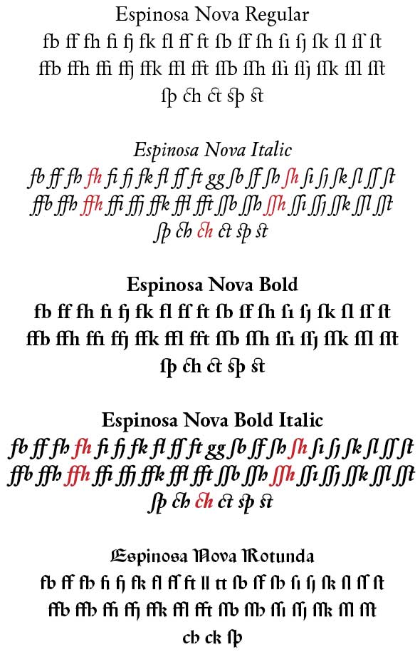
And sorry for the self-promotion, but given your love for ſ I guess you (and others) may be interested: I am finishing (kind of) my Espinosa Nova, which will include f- and longs- ligatures.

As for the code, I chose the easiest way: “sub s by ſ” in hist feature, and “sub longs longs b by longs_longs_b”, “sub longs longs h by longs_longs_h” and so on in liga (or dlig). I think it is a safe bet (but I still studying an approach similar to the one presented by Nick for a future update).

[Red color indicates a stylistic variant; the two first lines are for standard ligatures, the last one for discretionary.]

@ Christobal

And sorry for the self-promotion, but given your love for ſ I guess you (and others) may be interested: I am finishing (kind of) my Espinosa Nova, which will include f- and longs- ligatures.

Will there be a specimen (PDF) available, when you have finished Espinosa? Your f- and ſ-ligature sets look indeed complete. You even have not forgotten to include fſ and ſf. Adding ffſ and ſff would be probably too much. At least in German they would be forbidden.

> Will there be a specimen (PDF) available, when you have finished Espinosa?

Working on that at this very moment. I’ll let you know when it’s ready. And of course I will announce the release here on Typophile, too.

[ Following ]

Captured from web.archive.org on 25 Apr 2015. view this capture