John Wells's Phonetic Blog has a new post about the design of phonetic symbols in Calibri and Cambria. John Wells is a British phonetician and editor of the Longman Pronunciation Dictionary.
Here is what he has to say:
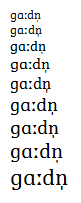
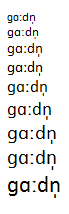
Calibri (like the font most of you will see in this blog) has a small cap i without the serifs it really needs for good legibility. It also has too much space before the stress mark, after the ɡ and after the length mark. In Cambria the serifs and stress mark are satisfactory, but the character spacing in the word ɡɑːdn̩ still leaves a lot to be desired.
The 'small cap i' is actually ɪ, the phonetic symbol for the vowel of 'kit'. I have to agree that even in a sans serif design where neither I nor the small cap i have serifs, this phonetic symbol needs serifs as they are an integral part of the symbol's identity. Lucida Sans Unicode is an example where the capital I has no serifs but the symbol ɪ does. Without serifs, I have trouble reading it as anything other than the Turkish dotless i.
Based on the samples on the blog, the spacing does look problematic and I agree with his assessments. I don't know how much of this is the inherent spacing and how much is the rendering and software used with possibly limited kerning support.
If you have any insights to share about the designs from the perspective of type designers to an audience of phoneticians, I would encourage you to comment on the blog itself, and we could also have a Typophile-specific discussion here.