Dear typophiles,
I am currently working on a small, but fun rebranding project for a vintage shop. It's not exactly an antique shop, because they don't sell old furniture, but they do sell authentic vintage stuff like posters, accessories, music records,... Besides the shop itsself, they also have a huge collection of stuff they rent out for tv or film productions. Let's say you need a complete 50s candy store for your movie; they can help you out.
The company exists for 25 years now and is called "Habbekrats" which means "for a song" in Dutch. This name was chosen because at the very beginning, they sold things at very low prices. Because this is not the case anymore, they wanted me to rebrand their shop.
The concept I came up with (and on which we already agree) is that it won't be called an antique shop, but a "time travel agency" ("tijdreisbureau" in Dutch), because they can take you to whatever era you want. The identity will logically follow from this concept, so the shop will refere to travel agencies.
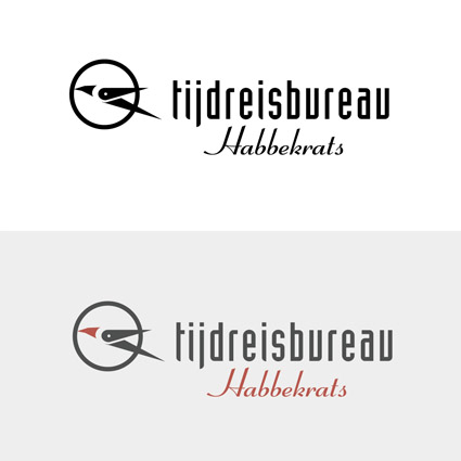
My question to you guys is if you could take a look at the logo and give your opinion on it. I'm very interested in all possible opinions and remarks.
A little explanation on the logo:
- the bird refers to airline companys (travel)
- the bird is built out of the pointers of a clock (time)
- the bird flies to the left (past)
Thanks a lot!
ps: this is the first logo I'm designing for a client, so I hope I did not make too many beginner mistakes.
| Attachment | Size |
|---|---|
| logo.jpg | 30.93 KB |