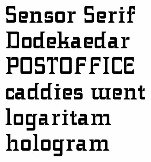
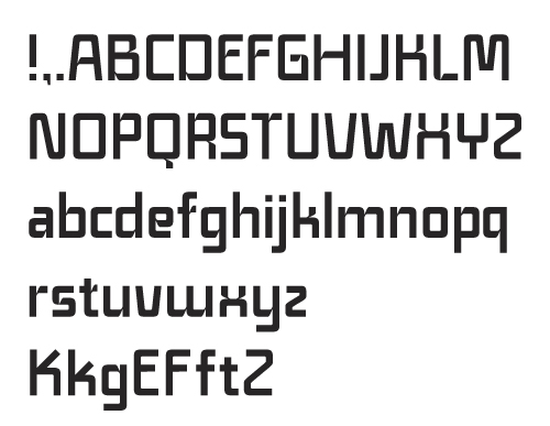
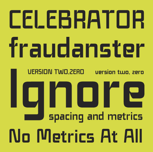
This is an typeface I tried to work on pauses during drawing of an another font that's soon gonna be traced.
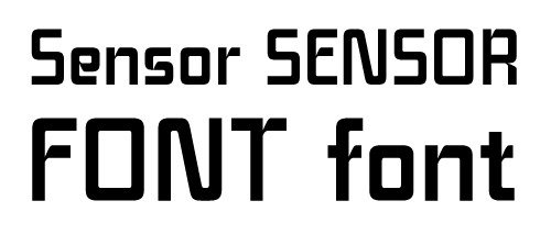

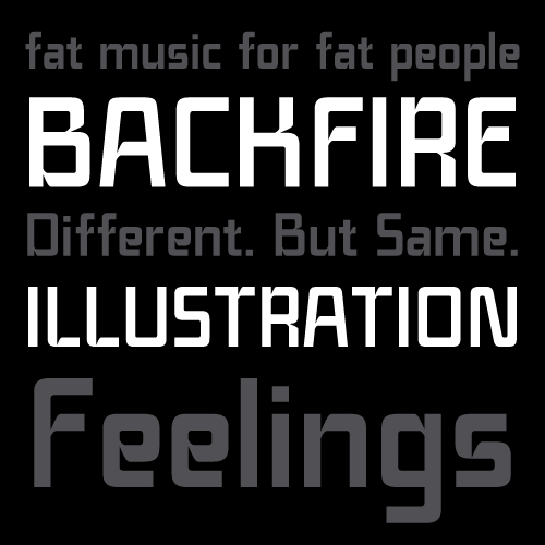
So far I did only all upper and lowercase + "."
Still without proper metrics done.
I'd call this rather only preview to decide whether is it worth to continue or not.
Any comments on this?
- Dusan
P.S. - Don't pay attention on proportions if it's possible, it's still far from good.
P.S. 2 - I still have a couple of doubts about some shapes... for example with /S/ and /s/, should they have "eaten" part of to be without it... and so on.
| Attachment | Size |
|---|---|
| Sensor_font.pdf | 66.04 KB |