
If you ask Ask what its font is, it doesn't tell you.

(But the .com is obviously Avenir.)
If you ask Ask what its font is, it doesn't tell you.
(But the .com is obviously Avenir.)
Looks to me like it started out as a Futura and then was tweaked.

I don't think it was Futura.
Looks more similar to Verlag or Nobel or Richmond to me.
We're in the ballpark, but I don't think it came from those, either. Here it is in black-and-white and rotated -9 degrees:

I'd have to go with Aaron on Richmond as the curvature on the inside of the S' match near perfectly. Also the point where the 'K' collides with the line to the left of it doesn't really look like the 'K' in the font family Futura,though it's just my opinion,you can try it out for yourself to compare.
Futura - http://www.linotype.com/472/futura-family.html?PHPSESSID=01f2963345451e8...

The ".com" is Avenir, I think, but I'm pretty sure that's not what you're asking.
Here's the original:

Here's Richmond Medium Italic, sheared and smushed into compliance:
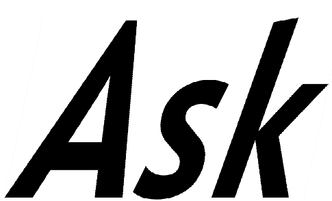
And here's a 50/50 opacity, with the original in red and Richmond in blue:

A few things: The top tails of the s's just aren't from the same letter. The bottom curves of the s's are very different weights. And while the verticals on the A's are the same weight, the diagonals on the A's and k's aren't. (All the letters were distorted equally.) I tried distorting just the Richmond k to get it to the right weight, but then the "<" was much too far to the right and too severely angled.
Captured from web.archive.org on 31 Jul 2012. view this capture