
I can not find a font to fit with this logo.
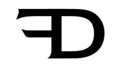
The font needs to be more classic not modern.
Thank you for suggestions and ideas.
Dan
I can not find a font to fit with this logo.

If you just want to spell out the name/service, why not go with one of the classics?
http://new.myfonts.com/fonts/bitstream/engravers-gothic/
http://new.myfonts.com/fonts/agfa/blair-itc/
PS> have you now decided to design the logo for your company yourself?
What do you think ?
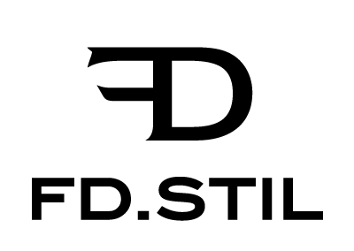
ps. Yes we are trying to come up with a logo. In Romania spending money on a logo is out of the question now.
We should be happy to have a company to fit a logo.

I like the match you have. Of course the font reminds me of Copperplate and that might be a good complement as well...

Is the logo not based on Newtext? Why not use that?
- Lex
I have already tried it with Newtext. I relay appreciate you spend time to help.
Don't you think is better to have a different font.
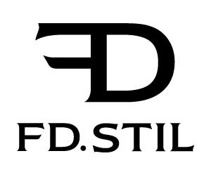
I much prefer the contrasting sans serif. But not really happy about the relationship between mark & name - explore!

I will move this thread to the ‘Design’ forum, as this is not really about Type ID.
1. Do you mean positioning text/logo. (size, ...)
or
2. You do not like the logo ?
Thank you.
Dan

I also think contrast would work better. I like the sans you used. My critique would be that the dot in the logo without a space looks a bit awkward, it probably should make it more recognisable, but I think it distracts and makes it harder to read. Maybe you could try a version without the dot? About the font: I think with the sans the whole thing gets a kind of art-deco flavour. Is this appropriate for you? Somthing slightly less extended might work better, or at least make it more contemporary. Something like Freight sans or Alright sans, perhaps.

How about this great new sans serif 'Contax Pro".
Captured from web.archive.org on 15 Oct 2013. view this capture