I've been lurking for months, but it's time to
poke my head out again & re-join the discussion. 
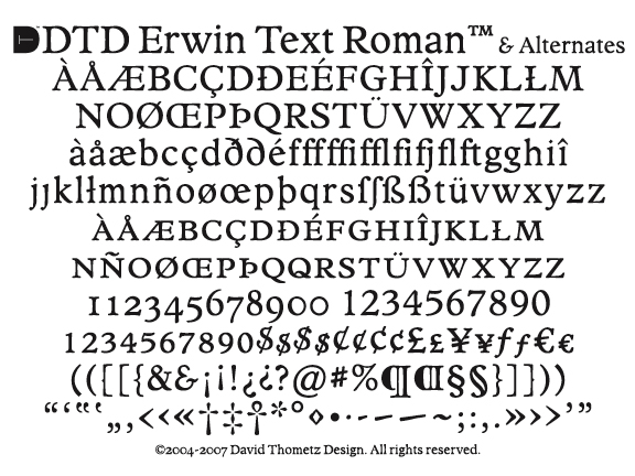
What if Cloister (Jenson) and Plantin had a child
who went into the newspaper business?

Erwin is a news text face designed for use in
the Erwin Record, a small, weekly newspaper
in the town of Erwin in northeastern Tennessee.
The paper currently uses ITC Bookman as its
body text typeface, but the editor is considering
a re-design.
I based Erwin on two of my favorite text faces:
Plantin, the grand-daddy of all news faces, for
sturdiness and practicality; and Cloister, my
favorite Jenson-inspired design, for elegance
and beauty. The x-height was increased, extenders
decreased, and overall width condensed to aid
readability and space economy.
The chief concerns are, of course, readability,
coupled with the rigors of printing on newsprint.
In addition, we want a font with a warm, homey,
inviting feel. Plantin and Jenson seemed to fit
the bill as models from which to begin.
Old-style numerals will be posted soon.
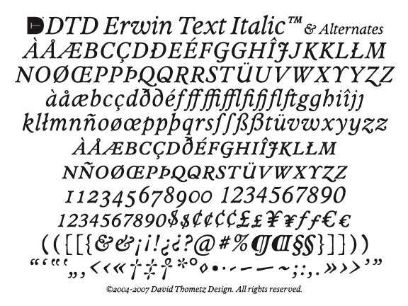
Small caps, italics, bold and ornaments are also
among the planned extensions of this family.
Any and all comments will be greatly appreciated.
David