
Can anyone tell me some political factors that influenced history of writing, assessing the impact in type design?
Can anyone tell me some political factors that influenced history of writing, assessing the impact in type design?

Check out The Secret History of Letters by Simon Loxley, it's anecdotal but talks about a lot of the historical, cultural, and personal factors that influenced type design/ers.
Looks like they just put it on google books. http://books.google.com/books?id=9AfP2prmEDUC&dq=type+loxley+simon&print...

There are a lot of tidbits scattered throughout Johanna Drucker’s books The Alphabetic Labyrinth and Graphic Design History: A Critical Guide.

The Face the Nation exhibition website may have material that would interest you.

Even more primeval...
http://www.amazon.com/Alphabet-Versus-Goddess-Conflict-Between/dp/014019...

Copyright.
For instance, the Worshipful Company of Stationers in the UK was a Royal body that exercised a monopoly over publishing in the UK from before the invention of moveable type until 1709, in practice until the 19th century in England, restricting the number of printers and what might be printed. The powers that be recognized the revolutionary power of the printed word. This made for a dismal, stagnant print culture in the UK, and prior to Caslon, the best types in the UK came from Holland. Caslon made his name making scholarly scripts, not the Latin alphabet.
The transitional style of typography emerged in Scotland (Baskerville came later), at the Foulis Press, because Scotland put into effect the 1709 repeal of the Company of Stationers' monopoly before the English did, thereby developing a thriving and dynamic publishing industry in the mid 18th century.
Concerning writing, in the early 19th century the practice of reading was spreading throughout the UK population, but books were still relatively expensive, so many people hand-copied popular novels &c., and circulated them amongst friends.

Nick, do you have any high resolution images of dated Foulis Press ‘transitional’ types predating 1757? I can only find small images online, which are not sufficient to reveal details of the type.
Oldnick, Shlain's alphabet/goddess book is a travesty. As the linguist William Bright concluded in his critique of the book at the 1988 Unicode conference keynote: ‘Any writing that purports to be non-fiction – whether scholarly books, technical reports, journalism, or business documents – is supposed to meet a basic criterion: You're not allowed to just MAKE IT UP. Shlain's work fails to meet this criterion.’
Bright's full paper is available here [MS Word file].

Shlain's alphabet/goddess book
I wouldn't call it a travesty. He presents his thesis: that the introduction of alphabetic literacy causes a temporary cultural emphasis towards left brain thinking. He backs it up with historical observation. The author does not present himself as an expert in the field, but as an amateur philosopher, who has glimpsed a pattern and through the research for the book, has tried to see where his insight leads him. The book is not a scientific work, nor is it presented as such.

Historical observation is limited by the readers experience. There are, undoubtedly, different sets of observations in written history and probably countless more which never were written down or survived until today to be read.

The entire history of Cyrillic—its development, its subsequent reforms and modifications (including the more recent goût bulgare, starting from its very invention—has been either brought about, or heavily influenced, or driven, by the political considerations, conditions and circumstances.
He backs it up with historical observation.
No, Shlain backs it his theory with claims about history, linguistics, literacy and neuroscience that are demonstrable not true, poorly understood or willfully misrepresented. In doing so, he also ignores actual socio-economic and other factors affecting the lives of actual women in actual historical and social situations, in favour of his ‘thesis’ that alphabetic literacy is responsible for social inequality of the sexes.
...high resolution images of dated Foulis Press ‘transitional’ types predating 1757?
John, I haven't seen anything high res, but these types look sufficiently transitional.
In particular the serifs on C and S, and the squareness of the serifs on E.
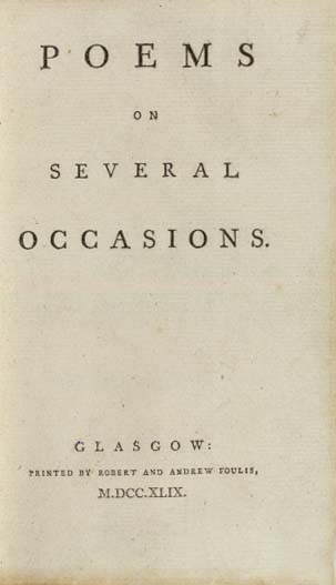
The layout is also severely minimal, generally identified as Baskerville and Bodoni's neo-classical/transitional look.
Thanks a lot for your answers! They will be useful for my study.

JH> Bright's full paper is available here [MS Word file].
Doesn't that say it all? A word file?
dg> Can anyone tell me some political factors that influenced history of writing,
I began with Exodus. It ended with "the goddess" seizing control of rendering with the imaging-thinking rather than letter-thinking software of Quartz 'n Cleartype.
We've all been brained right down the middle!;)
Cheers!

Stanley Morison's Politics and Script covers political / social influence on early Greek and Roman writing.
George
Thanks, Nick. Yes, the layout is pure neo-classical. Any idea of the provenance of the type? I'm guessing this was cut for the Foulis Press. By Wilson?

The switch in Turkey from Arabic to Latin script was a political decision.
That's what I'd assume.
But did he actually cut the type, any more than Baskerville cut his faces?
Certainly, they were both handy enough.
**
Also to consider: the abolition of various publishing taxes (stamp and paper) in England in the 1830s.
This reduced the selling price of books, and especially newspapers and magazines, boosting circulation and stimulating these as vehicles for the advertising of products such as books, as consumer items. The new magazines were breeding grounds for authors such as Dickens and Thackeray.
Here is an example of the old and new. On the right is an ad espousing tastefully classic upscale understatement on thick, handmade paper; on the left, the new jazzy commercial style of mixing wildly disparate fonts, informed by posters. So this is the market for the new Figgins sans, and how it was used.

At one time or another in the 20th century, Arabic, Cyrillic and Latin scripts have been the official choice of Azerbaijan.
Captured from web.archive.org on 20 Oct 2013. view this capture