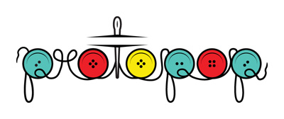
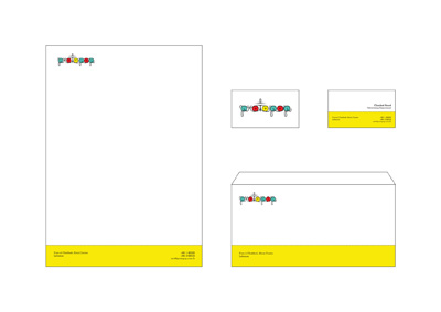
This is the logo I'm working on for my final project this semester, and it's for a fashion designer friend of mine as well.
Proto-Pop Art originally preceded Pop Art back in the 1950s, so my friend chose that as the name since his style isn't classical, it's a bit experimental and consists on using many objects from popular culture in his dresses and creations.
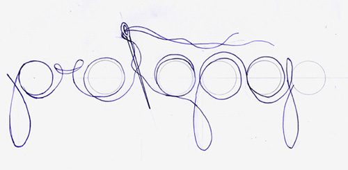
I first began with some sketches, and came out with the idea of using common sewing materials to create the logo since that's basically what Proto-Pop Art was about. Below is one of the final sketches:
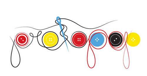
After the sketches, I tried tracing it digitally but was very unhappy with the results, even after experimenting with one letter for the logo or the whole word, like:
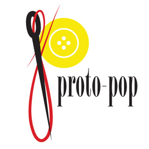
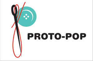
then I created using wool and glue, the word "protopop", since I felt it would be best to trace over something that's done manually:
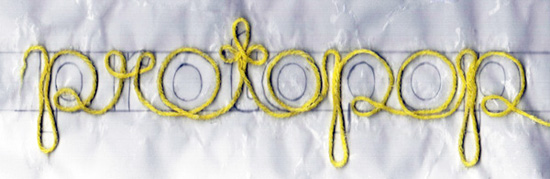
I scanned it and traced it digitally, and was able to get to the final logo here:

But I still find it kinda off and unbalanced, and a bit too complex for a logo, which is why I created a second option.

Finally, what I need is informative critique by other people on how I can fix the first final logo, or maybe join the two or just any constructive feedback, because I already like the concept I begun with.