
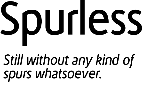
Spurless started with a name "Polyester", but with wrong connotaion is now with a new name, and also with italics.
| Attachment | Size |
|---|---|
| Spurless Book and Italic sample.pdf | 406.71 KB |
Spurless started with a name "Polyester", but with wrong connotaion is now with a new name, and also with italics.
| Attachment | Size |
|---|---|
| Spurless Book and Italic sample.pdf | 406.71 KB |

I tried a similar experiment last year and found that the abrupt spurless stroke intersections clash with the humane qualities that are needed to liven up the design. I’m seeing the same thing here; there’s some dissonance being created by letters like u and r and the italic k.
I'm with you on 'k', but with 'u' and 'r' I think it works. I'm now thinking of more oblique rather than italic style, that's why 'a'. That 'k' was something of a tryout…
The reason to study this kind of design was that I've never liked any of them; most of them have been over-designed, with weird 'y's and'k's, or rounded corners to hide the flaws and such.
So I try to make a working one. Let's see how it goes.

I think your 'u' and 'r' work. The 'p' is too heavy where the bottom of the bowl meets the vertical. Starting to like the forms, spurless or not. Your 's' and 'e' are very lively and balanced.

Is there a specific reason why you're using this same (and very idiosyncratic) double-story "g" form in so many of your fonts?

Looks a bit like about to be falling over backwards :-) Andreas
That is a good question, Ms Stoessinger. That glyph has been my favourite for a long time. But you are right; I've strayed way off from this:
http://www.t26.com/search?q=target
I started with pretty basic Gill Sans-style 'g's (http://new.myfonts.com/fonts/suomi/tang/), and went all the way to those overly wonky ones. But it is indeed one of my favourite glyphs. I'll give it more thought in the future.
Captured from web.archive.org on 24 Apr 2015. view this capture