
Hi all
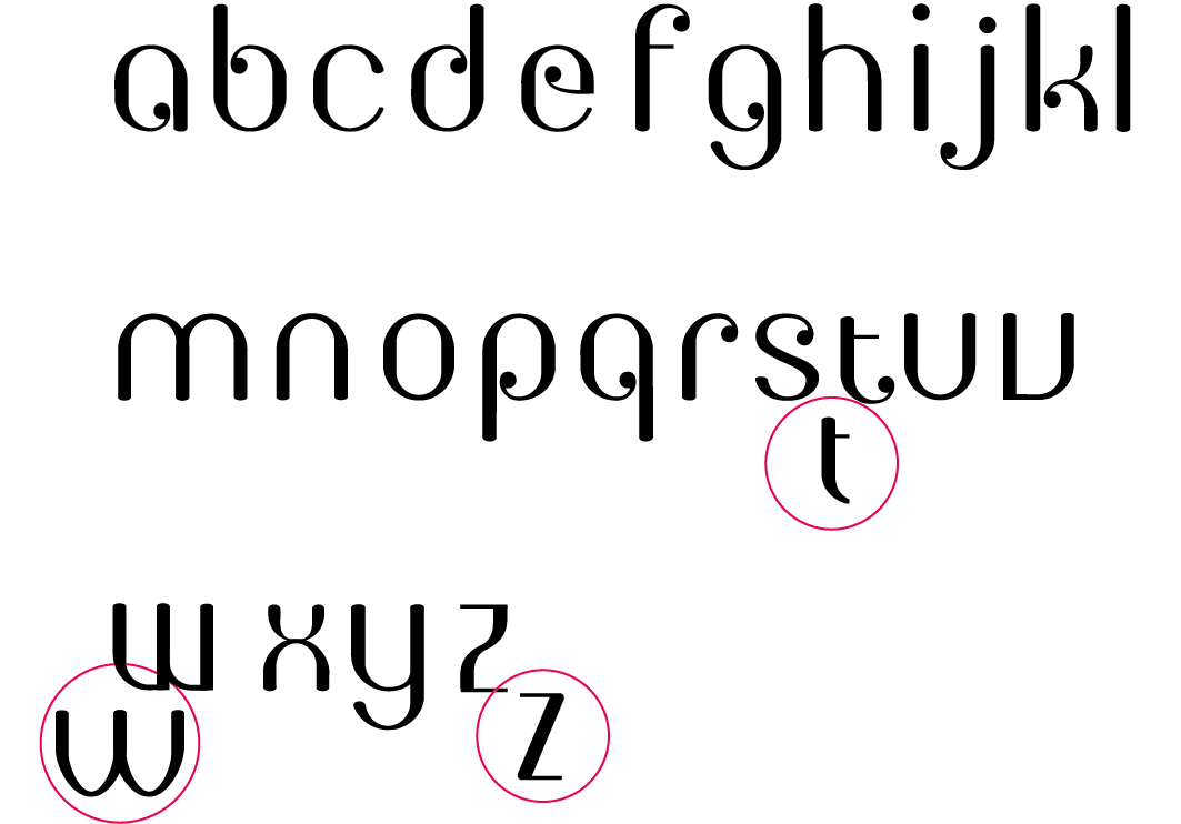
Im 'trying' to become more skilled in type design and here is an example of one of my early work. It is not based on a particular pre -designed font. Constructive feedback is more than welcome:-)
| Attachment | Size |
|---|---|
| Picture 46.png | 43.71 KB |
Hi all
Im 'trying' to become more skilled in type design and here is an example of one of my early work. It is not based on a particular pre -designed font. Constructive feedback is more than welcome:-)
| Attachment | Size |
|---|---|
| Picture 46.png | 43.71 KB |

Zahra, you’ll have better luck and get better responses to your request for feedback if you post this in one of the Typophile Critique forums. This sort of thing is precisely what those are intended for.
Thank you kenlew. I just posted it on the forum. Sorry! im kinda new here x

It is always easier to tell the utility of a typeface if you show some us some words. :)

Yes, some words would be nice. :]
Just looking at the alphabet though, some things do stand out to me.
- /v/ and /u/ may need more differentiation
- the strokes could remain thin when curves meet stems (for example, in /h/)
- it kind of feels as though /s/ ought to have those big ball terminals...
Anyway, I'd hardly call myself even at the level of novice, so take my words with a grain of salt!
That's absolutely fine. Thank you for your feedback :-)
Any opinions on the T?
The short t is unusual but it may work. One thing you could try is to make the crossbar longer, to give the letter more presence since it's so small.

Also, you could raise the t above x-height.
I would have it a little more "sitting" too.
Hello and thank you all for taking time to view my work. Here I have made a few changes and designed the numerals. Do tell me what you think:-)

Captured from web.archive.org on 17 Apr 2015. view this capture
