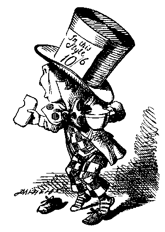
Can anyone shed some light on the tendency to set the dollar sign smaller and above the baseline? It's a widespread enough practice that I wonder how it all got started. I think it can look fairly decent on signage/ads if the proportions are handled well but I could see how this might be a typographic sin to others. Would you do the same in certain situations?