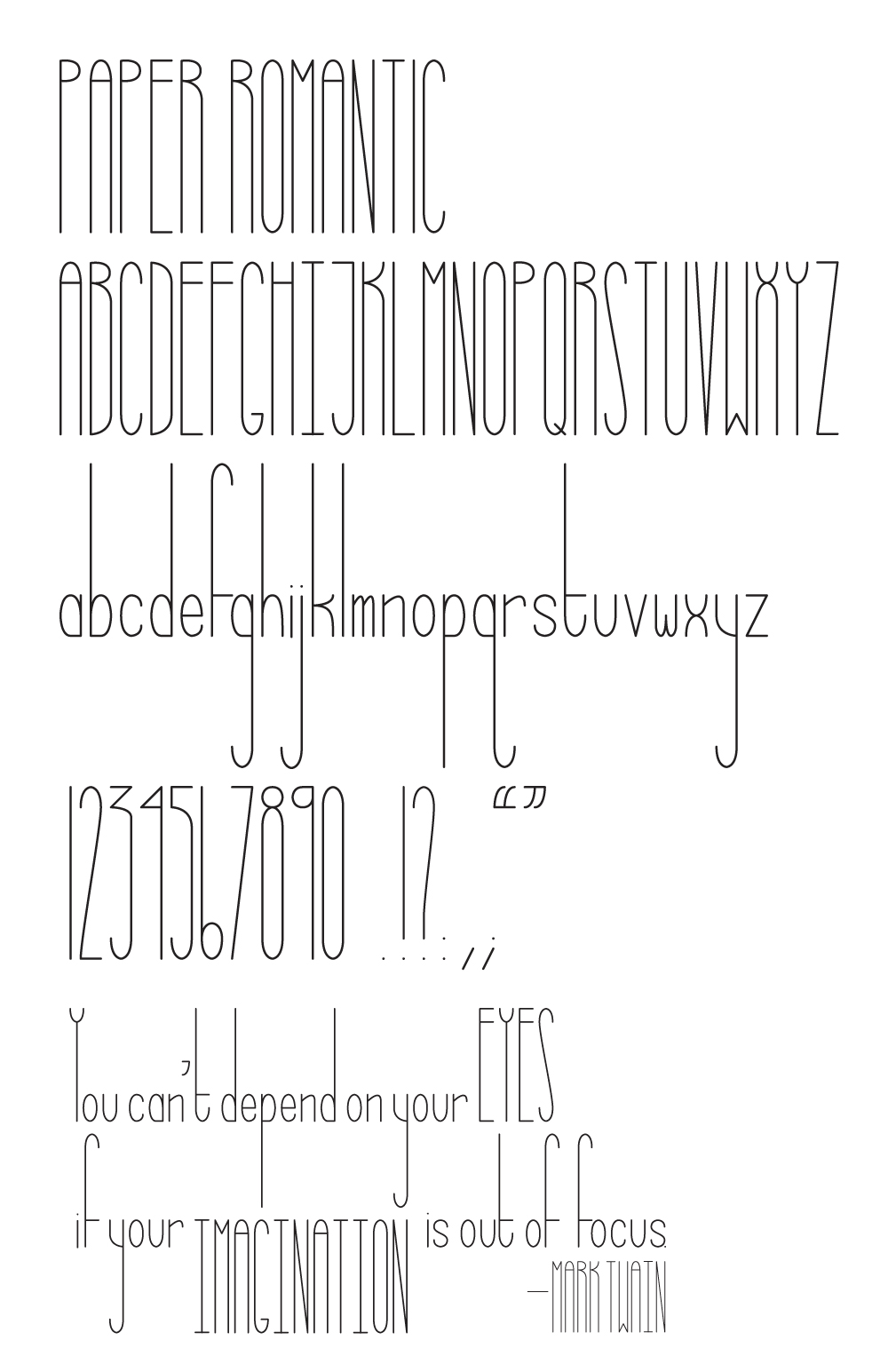
This is the first iteration of Paper Romantic, based on a few doodles I found in the margins of an old college notebook. This is the first time I've tackled digitizing any of my little typeface experiments, so any and all feedback is greatly appreciated!
I know the /N/ feels very out of place, but I'm not sure how to resolve that. Also, I can't tell if the lowercase is working or not. Some of the letters seem to fit, while others just look wrong.
Thanks so much!
| Attachment | Size |
|---|---|
| paper_romantic.jpg | 201.46 KB |