Typophile

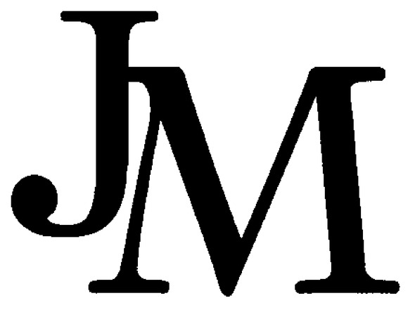
Serif font with ball J and sloped M

-frabjous-

Trying to help a friend figure out the font of this logo for his boss.

To me, who is not any kind of expert, the J looks like Georgia or NC Schoolbook, the M like Plantin. It's hard to believe they'd actually be from different fonts, but who knows?

AttachmentSize
JM-out.jpg37.53 KB

There is something about the serifs, in the way they are not sharp-edged, that is not typical. Ray Larabie's Winthorpe has an M very much like this M, although a bit curved on top, and not curved in the left M leg as much. The J has the rounded serif, but it is too long and the hook and ball isn't right. It's possible that it was shortened and a ball terminal was grafted on, but that might be reaching a bit.

Taken by itself, I think the J looks most like Scotch Roman, rather than New Century, but the serifs are not as soft looking as these. It's possible some tweaking was done, and if you consider that 'cheap' sometimes appeals to designers, it may have been an inexpensive (or free) font, or something that comes with standard font packages. I thought the Plantin M looked more twisted than this one.

I think you could be right about mixed fonts, because there were no serif families I know that have this J and a similar splayed M.

- Mike Yanega

It may also have a slight rounded stroke added to it. That would effectively round out the otherwise sharp serifs.

I agree James. I guess my point is that this is probably not a single 'stock' font. Some changes have been made, and probably more than one font was used.

- Mike Yanega

Thanks for your help!

If we work under the assumption that the two fonts are different, I definitely think Winthorpe is a possibility for the M.

The J still puzzles me. After a closer look, I think Schoolbook is out, but Scotch Roman doesn't look right to me either. Poking around a bit, I think Century 731 or something in the News (News 705?) family might be more likely. Still, neither of those seem quite right either, and definitely I think it's possible that the serifs on the J were modified, perhaps to more closely match those on the M.

And if the letters are being modified, why not consider that a ball was added to the hook of the J? I kept looking for a match to the counter at the J hooks, and very few were anywhere near the right shape, mostly because the serif wasn't a round ball. If you add your own ball, you only need the 'jawline' of the J to be the right shape.

- Mike Yanega

Captured from web.archive.org on 23 Jun 2012. view this capture