Typophile

Manicotti

David Jonathan Ross

Hi everyone,

I wanted to let you know that my typeface Manicotti is now available for licensing on MyFonts. It was honored by the Type Directors Club in 2007, and since then I've expanded it to include lowercase, unicase, more swash variants, and ornaments. Manicotti was a whole lot of fun to draw, so I'm hoping that it is equally fun to use!

Warmly, David

http://www.djr.com/typefaces/manicotti
http://www.myfonts.com/fonts/djr/manicotti
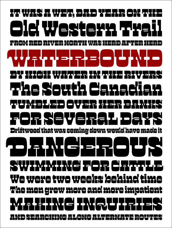
Yes! This is great to see, David. And it's fun to play with.


Hey, now we can all have business cards like you! <:-)

Congrats David!

Thanks to both of you!

Nina, glad to see you found the manicules and unicase. Don't forget about the contextual alternates and discretionary ligs as well, if you really want to go over the top...

> Hey, now we can all have business cards like you!

If you like to see a wide variety of looks on people's faces when you hand them your business card, then by all means set the whole thing in this font!

Fun!

I love this!

It’s amazing how great these kooky old designs can work in an era when quality drawings are more important than just banging out a font. Great work!

Good design looks easy. And it's so hard to get. Congrats, nice style!

It's funny how this style, invented in England in the 1860s (as a moderation of the completely bizarre "Italian"?), has come to signify the American Wild West.

It's funny how this style, invented in England in the 1860s (as a moderation of the completely bizarre "Italian"?), has come to signify the American Wild West.

I have noticed the same things; lots of styles that came out of New York or Boston, created by Scot, German, and English immigrants, all on the covers of books about cowboys. I think it probably has something to do with the American Wild West being largely mythical to begin with.

Many thanks to all of you guys for your kind words about Manicotti.

I agree that it's funny, and at the same time a little sad, that this style has been pigeonholed to the extent that it has. While Manicotti doesn't follow the old French Clarendons very closely, it does take almost every opportunity to play into that faux-Western stereotype.

This is the exactly the kind of thinking that encouraged me to return to this style and draw Trilby. Among other things, it was an attempt to cast off some of the long-held associations of reversed-stress slabs.

Captured from web.archive.org on 19 Oct 2013. view this capture