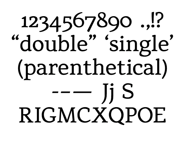
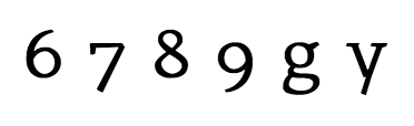
I recently completed the English lower and upper case glyphs for this design. This is my first real attempt at designing a font, so naturally problems abound... It's getting to the point where I can tell that things are wrong, but I don't know exactly what or how to fix it. Trying to get a consistent color is killing me!
I have yet to even touch spacing/kerning, so I already know that's an enormous mess. No hinting as of yet, either.
I would like to get your opinions before I continue with numerals, diacritics, and such.
| Attachment | Size |
|---|---|
| leika_draft.pdf | 8.17 KB |
| leika_draft2.pdf | 9.28 KB |
| leika_draft3.pdf | 15.78 KB |