Typophile

34 Typographic Sins Poster

godfrey.jim

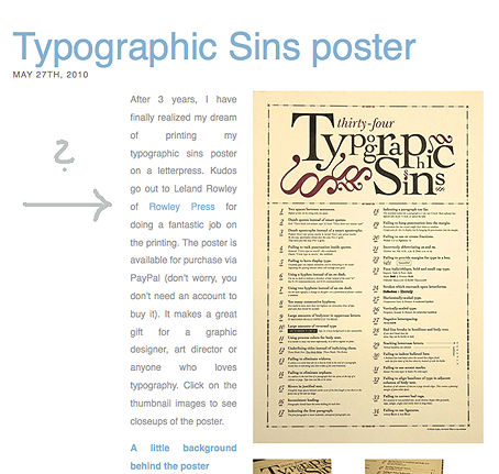
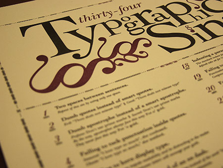
Typographic sins are those little things novice designers, students and Mr. and Mrs. Desktop Publisher always do with type. You know, putting 2 spaces between sentences, using dumb quotes instead of smart quotes, etc. Well, in an effort to educate the public (or at least entertain those of us who know better), I have designed a poster with 34 typographic sins that I hope people don't commit. Some, like those mentioned above are obvious, others are a little more obscure. I letterpressed my poster at Rowley Press and you can purchase them on my web site: jimgodfreydesign.com.

Save the typographic soul of a loved one, or your own.
Nice work. Also, your portfolio on your website show some pretty good idea. Congrats!

Failing in justification ;-)

Touche.

You know how it is. As much as we would like the web to be print, it is not. The type is defined in ems, however, so if you want to set your default type to a smaller size, that eliminates most of the rivers. :)

P.S. I know, I know, it should be touché (with an accent). I hit post too early.

Sim,

Thanks for the compliments. Glad you like the work.

It looks pretty good.

The one about "indenting bulleted lists" is more choice. Hanging punctuation can have its place.

Captured from web.archive.org on 16 Apr 2015. view this capture