Typophile

(x) ID Gotham Newspaper font / blackletter - Fette Kanzlei aka Germanica {Eric, Florian}

rberesh

Hi all,
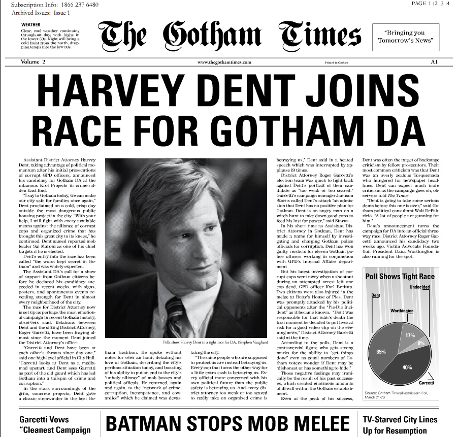
I wondered if someone could identify the font used as the title to this newspaper. I am looking to see what font is used for the words The Gotham Times at the top. Thanks in advance.
http://host.trivialbeing.org/up/tdk-mar26-gotham-times-issue2-harvey-den...

Horrible spacing/kerning in the masthead.

For the headlines – shouldn’t that be Gotham instead of Univers?

Ugh, it looks like they tried to imitate the NYT with the masthead, but they gave up with the rest of the layout and wound up with That Thing. Why is it that filmmakers who otherwise have such attention to detail think it's okay to just throw together a newspaper like that, especially if the newspaper plays some sort of role in advancing the plot (which it usually does if they bother to make their own newspaper)? It always takes me out of the film when there's a poorly designed newspaper with an important plot-point headline.

Edit: It's Germanica.

Hi Ryan,

this looks like Fette Kanzlei.
F

Eric, yes, Germanica is another digitization of this historic Fraktur. Fette Kanzlei is the original name.

Thank you so much to all for your help! Much appreciated!

Ah, okay. I just went through DaFont until I found the right one, which is my SOP to identify poorly-spaced grunge or blackletter fonts.

In an earlier post, I was trying to have a type identified on the webpage
http://www.whysoserious.com/ Its the brown note that has the heading "To Do" at the top. I was recommended to use broken typewriter, just wondering if you all concur or would suggest anything differnet?

It looks like they used Courier and did the broken baseline manually, which is funny because a broken typewriter is one time where that sort of effect should be consistent.

Yes it is strange.

Captured from web.archive.org on 20 Nov 2014. view this capture