Hi,
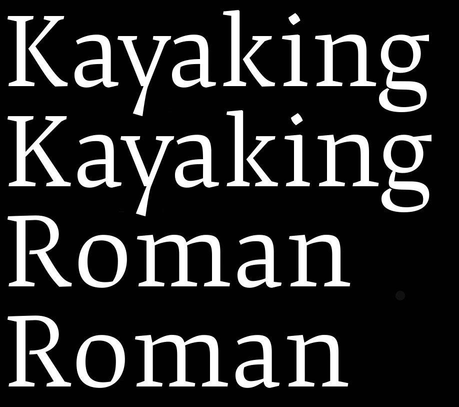
I am choosing between R and K. Which one is more appropriate to the design?
| Attachment | Size |
|---|---|
| RK.jpg | 74.84 KB |
| Picture 5.png | 155.25 KB |
Hi,
I am choosing between R and K. Which one is more appropriate to the design?
| Attachment | Size |
|---|---|
| RK.jpg | 74.84 KB |
| Picture 5.png | 155.25 KB |

I like both, to me the first one are the one I would choose as the main letters. However, you could use the second one in an alt glyphs. Personally I would close the bottom of the bowl of the R.
Thanks.
You would close the bowl of R, even though P has an open bowl?

I'd also prefer the first ones - the roundings fit more to the 'free' lines of the /y/ and /a/.
Thanks Artur, good point.

You would close the bowl of R, even though P has an open bowl?
That has precedents; see for example Plantin.
Perfect example. Thank you.
Captured from web.archive.org on 22 Jul 2014. view this capture