
I'd like some fresh eyes and opinion on this type I've drawn for the town of Quepos, Costa Rica. There are a few things I want to tweak, but I'd welcome any thoughts :o)

| Attachment | Size |
|---|---|
| QUEPOS.pdf | 70.97 KB |
I'd like some fresh eyes and opinion on this type I've drawn for the town of Quepos, Costa Rica. There are a few things I want to tweak, but I'd welcome any thoughts :o)
| Attachment | Size |
|---|---|
| QUEPOS.pdf | 70.97 KB |

Dave, great stuff! Love the overall feel - but can't help reading Quebs, Maybe this can be fixed by slightly adjusting the 'tails' of the P and O? Also, would like to see the bottom tail of the S curling up instead of down. Keep us posted.

I agree with seb - the overall feel is really beautiful, interesting and lively. It's not terribly legible, however. My first take was "Ruebs." I think the Q needs more work to read correctly - it's too small to be an uppercase letter. Have you tried a lowercase q?
Maybe the "po" wouldn't read as an uppercase "B" if the whipped peak on the o wasn't reaching up to touch the bowl of the p? It's beautiful, but as it is, detracts from the readability and legibility.
How do these revisions look? I tweaked the terminals on the P and the S. I also gave the POS a bit of a slant forward as I felt like they were too upright compared to QUE. Thoughts?
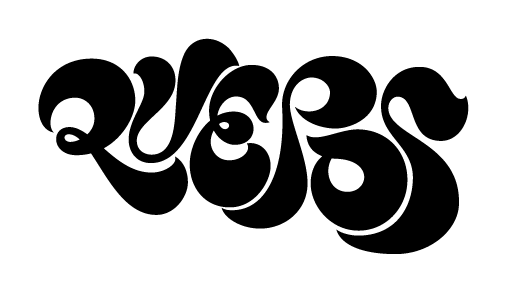

Yum!
Is there going to be a color version of this? I'd love to see it in bright happy colors.
Something very minor that my eye got sort of stuck on: The very bottom of the "S" looks a bit bumpy (unhappy outline)? But it might also just be the rendering.

I still have the QUEBS problem.
Would it help to make P's bowl turn into a full loop, ending in a taper over the right part of E?
Nina: I'll check that, though it's probably a rendering issue. I need to show the client and figure out the palette of colors where it will be placed in the town. There is talk of recreating it via a tile mosaic, so I might just be supplying the outlines to her.
eliason: Hmm, I'm not sure I understand your suggestion, but i'd like to try it. Would you care to do a quick sketch over what I have now?
I'm also feeling like the O/S combo is too tight and evenly nestled together. Anyone else have any input on that?
eliason: Hmm, I'm not sure I understand your suggestion, but i'd like to try it. Would you care to do a quick sketch over what I have now?
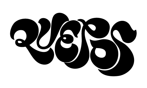
eliason: Hmmm, not sure that I agree with you on that.
Is anyone else bothered by the overall shape and tilt? Why is the S and the o so much bigger than the Qu? The shape lacks finesse, and I fear it will be hard to insert into media without looking wonky.
Currently, it reminds me of a souffle about to collapse off to the right. Or perhaps a balloon in the midst of being blown up? Expanding puddle of molasses? A whipped-cream cornucopia? (Ok, I'll stop with the dopey visuals now, fun as it is. I think I'm hungry.)

I was also a little confused about the slant. I think that if the size is scaling bigger from left to right, the mark should either be perfectly horizontal OR more likeley diagonal, bottom-left to top-right.
I think this here revision is it, thanks for your input everyone!
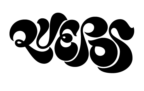
Dave,
I'm still struck by the odd slant and shape created by the scaling of the letters. It's especially glaring when you couple the logo with text. I couldn't stop myself from playing around with it, but I won't post my tweaked/revised version here; I'll email it to you (to the address on your website) from my yahoo account. I really think you'll like your beautiful (!!) lettering even more if you tweak away the slant. Right now, the oS feels kinda like it's being being sucked away by a vacuum cleaner.
AK
Dave,
this has come along nicely. Some small things, I agree with Alaskan on the slant and I am little 'confused' about the fitting of the letters - most have a very tight fit with even spacing, but ex. the top left stroke of the U doesn't wrap around the Q as I think it should. I hope you understand what I mean?
I'm putting this project to rest, here is the final version. Thank you, all, for your input!
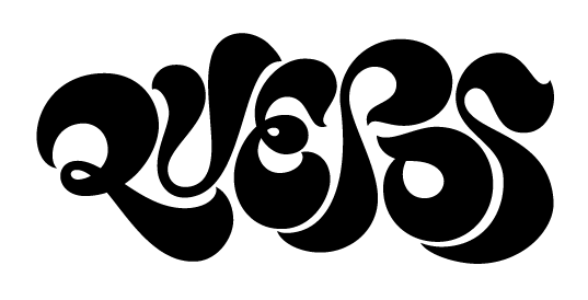
Great! It looks much, much better now, and it will be much easier to fit into typographic media. I did like the p in your last post better (4.Jun.2010 4.33pm) but it's fine this way, too. Congratulations - it's beautiful, polished work!
Thanks, Alaskan!
Looking at the negative spaces is soooo gooood.

I'm so hurt! *sarcasm* I wish I'd known this thread existed. Did you get my DM on twitter?
Well, it is done but I have to say I like how you finished it.
Captured from web.archive.org on 14 Apr 2015. view this capture