
not the first i know - interested to get some feedback on it anyway
thanks in advance :)
| Attachment | Size |
|---|---|
| c prelim.PNG | 35.85 KB |
| CLARINETS.PNG | 10.32 KB |
| SAVINGS.PNG | 10.27 KB |
not the first i know - interested to get some feedback on it anyway
thanks in advance :)
| Attachment | Size |
|---|---|
| c prelim.PNG | 35.85 KB |
| CLARINETS.PNG | 10.32 KB |
| SAVINGS.PNG | 10.27 KB |

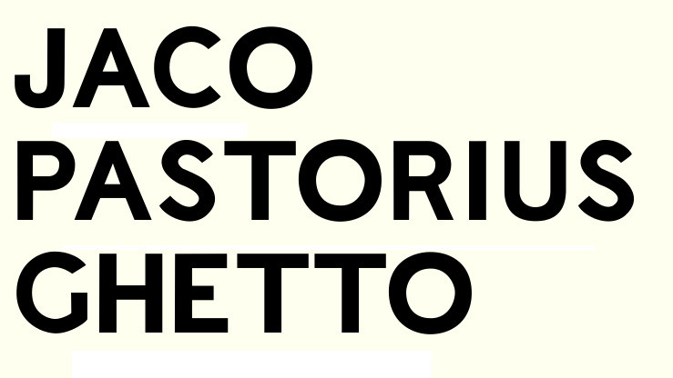
I would make the G less smooth.

Agreed, and /L/ and especially /T/ look awfully wide.
thanks guys - made some changes based on your tips
regards

For the G, I was thinking something more like this:
http://new.myfonts.com/fonts/presencetypo/tschichold/
Also: the O could use some overshoot, and the J is a little light.
thanks. im playing with a few g ideas now - here are the other two. what do you think?
sorted out the J too. the O does have overshoots (im concerned about them being too big! :) - it must have been the small sample I posted
here are the Gs
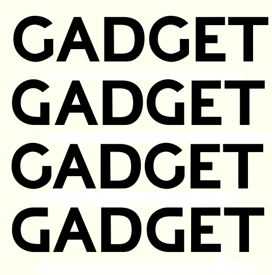
leaning towards the last one tbh. worried that its a bit star trek though
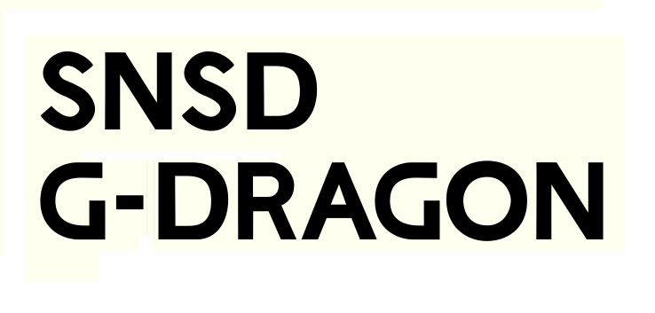
I'd look at some 19th-century sans-serif designs for ideas on the /G/.

Does the /O/ look top heavy to anyone else?

There's something about th /S/ maybe it's just the way it's rendering on my iPad but it's a bit uncomfortable, it just doesn't look smooth to me. I would keep working on the /G/ and take elisions advice because right now I think it is the weakest link in the chain.
thanks for the feedback guys.
i redrew the S using beziers in extrema and made a new G.
here are a few more letters too. rip it to shreds please I want to improve :)
cheers
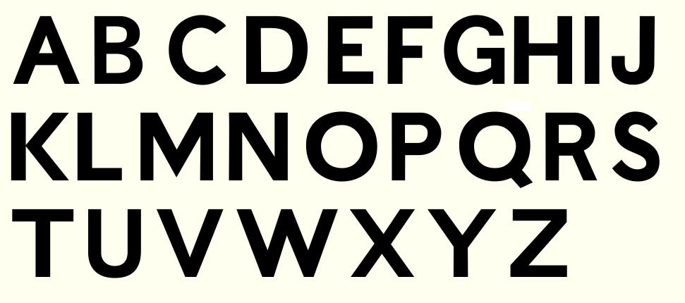
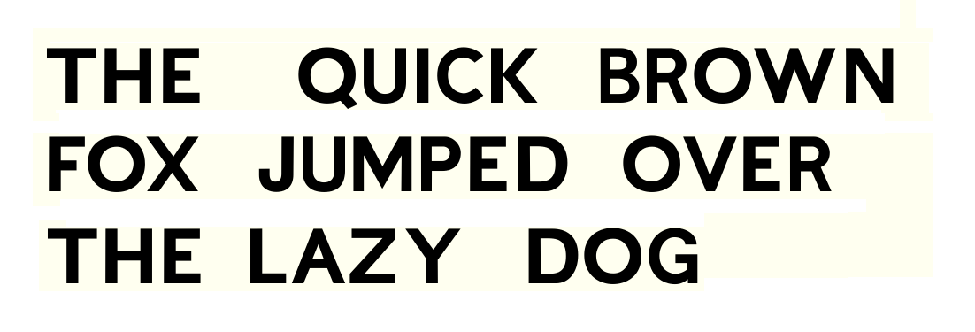
not happy with the S at all. working on it. seems to be a tricky letter


On your straight lines you seem to have a reasonable balance between horizontal and vertical thicknesses, but maybe you haven't carried that over to round shapes like the "O"? The vertical parts need to be thicker than the horizontal parts there as well, to look visually similar.
Cheers,
T
The X and Y seem a bit light, and I don't know if that's just my eyes, but it almost looks like the bottom-left to top-right leg of the X doesn't cross the other leg in one straight line. It also looks, visually to me at least, like the top of the C overhangs the bottom. And the O is still looking a bit heavy to me.

And your 'S' looks wrong in many ways.

In Y and V (maybe also in the W and in the A) are likewise irregularities, that don’t seem to be intended. After many hours in front of the screen, I am not sure.
thanks for the ideas guys. ill be back soon with more
Too many cooks . . . the first version you showed was on the right track. The proportions were strange but that's what was cool about it. Keep whittling it down and you'll end up with a Gotham clone. Pointers are pointers but don't let a bunch of people design it for you or it'll lose all its personality. I've watched a lot of fonts get spoiled or amlost spoiled by committee on Typophile. Everyone here has their own idea of what looks good but if you average it all together it's just a gray mass.
Don't let beziers design your S for you or you'll end up with a generic S. Try making a an S only using straight lines. Spend an hour moving those points around and testing in words. When you're comfortable with it, then works on beziers on another layer. About half the time I spend on an alphabet is on the S and X . . . tough letters.
.
thanks for all the ideas guys. especially Ray - you raised a very good point sir
be back with more soon - jumping ship to fontforge as typetool is getting on my tits
ta ta
Captured from web.archive.org on 15 Apr 2015. view this capture


