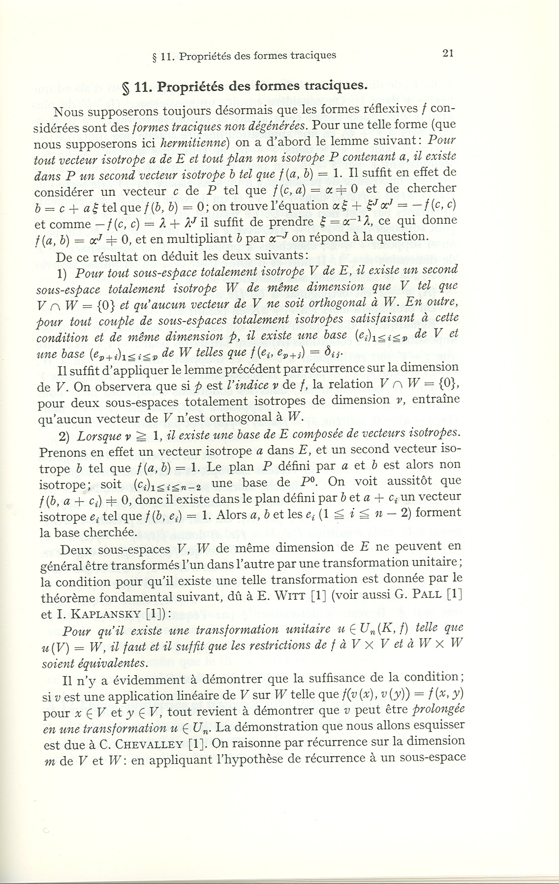
Does someone know what font Springer was using till at least the seventies in the Ergebnisse der Mathematik and other scientific series. The italic f was very distinctive:

Here is a full page:
| Attachment | Size |
|---|---|
| page21.jpg | 694.5 KB |
Does someone know what font Springer was using till at least the seventies in the Ergebnisse der Mathematik and other scientific series. The italic f was very distinctive:
Here is a full page:
| Attachment | Size |
|---|---|
| page21.jpg | 694.5 KB |

The italic r, p and g suggest some flavor of Caslon, perhaps one of Mergenthaler Linotype's versions...

Monotype Old Style Italic. The stubby 'f' strongly suggests this is the Linotype version of the font, and of course the digital version is spidery and thin compared with the book size printed on paper with ink spread, like all of the worst of the Monotype digitizations, but otherwise it looks like a match to me.

In looking at the Old Style samples in the "Encyclopaedia of Type Faces" by Jaspert, et al. I do not see a good match for the 'f' in either the Monotype or Linotype versions that are shown. The 'r' looks most like the Monotype version, and in looking at the full page sample, I found a Roman 'g', and it looks more like the Monotype Old Style 'g'.
The italic 'f' still seems to be a problem, for none of the samples, including an old Linotype catalog from the '30's shows anything quite like it. BTW, Old Style No.7 in the Linotype catalog had a rather narrow 'f', but not this narrow, and the Roman 'g' was not so close, and the italic 'r' was not as much like a 'v'. The narrowness of the italic f in your sample is not quite like any samples I could find.
- Mike Yanega
I also spent a fair amount of time staring at some of the Baskerville metal type samples, which had somewhat similar italics, but I think some version of Old Style seems likely to be the answer.
- Mike Yanega
Raph,
That looks like a match indeed. Even the fi ligature looks the same, with the lower part cut. I presume the digitization was made from a larger size, which would partly explain why it seems thinner. I also presume the smallcaps were taken from a smaller size. Is our current notion of smallcaps an invention of the digital age?
Michel
Is our current notion of smallcaps an invention of the digital age?
Not at all, this convention has been around a long time for book printing. SC letters were often a part of the serif text families, and the letters were specifically designed for that size, not just re-scaled.
- Mike Yanega
Captured from web.archive.org on 14 Apr 2015. view this capture