Typophile

Type Anatomy Reference

nitingarg

Hi.

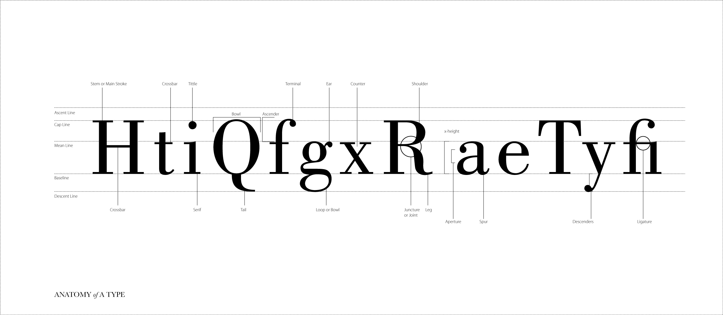
I am new to typography & recently started reading about typography in detail. As a first step, i am trying to understand type anatomy, to help myself i making a simple poster with type anatomy explained, so i can stick it in-front of me & let it hammer in my mind.

Till now, these are the details i am able to fetch from various sources : http://nitingarg.com/shared/first-draft.jpg

Now, it would be really helpful if you can just check & let me know if i am missing something or done something wrong there.

Thanks for your time !

A few quick notes:

If "ascender" is singular, "descender" should also be;
The word and the line associated with "Spur" don't align with anything;
Technically, "fi" as a whole represents a ligature, not simply the crossbar which joins the two letters in your example.

'Technically, "fi" as a whole represents a ligature, not simply the crossbar which joins the two letters in your example.'

But it can also be, as the word 'ligature' implies; the OED gives this:

5.5 In Writing and Printing. Two or more letters joined together and forming one character or type; a monogram. Also, a stroke connecting two letters. in ligature, combined in one character or type.

Overshoot and sidebearing could be added. Possibly kerning, which is sidebearings that overlap.

The callouts for "bowl" and "counter" could end in the middle of the spaces they describe, not on part of the type that surrounds those spaces.

In his Short History, Warren Chappell included a drawing of a piece of metal type, which gives concrete identity to some of the more abstract spatial concepts of typography.

I would lower the mean line to be at the top of the x. Then you could add "overshoot" as Nick suggested.
I agree the other Nick that I wouldn't call the crossbar in "fi" itself a ligature.

re. ligature: certainly, the part that joins two letters, is, from an etymological point of view, the salient quality of a ligature, but in typography it is generally understood that a ligature is a two (or more) character glyph, where the shapes of the constituent glyphs are modified as they coalesce. So it's important, for instance, not just that there is a single joined crossbar in "ff", but that the ascenders of the two "f"s generally differ in height.

I was going to say that the first f is shorter, but then I remembered Blado.

Thanks a lot for such valuable replies. Ligature i figured out is a term for the whole form made be two characters, not the crossbar.

@Sir Nick, thanks. I got your point, may be placing a 20-30% gray shape indicating the negative spaces of counter could be one solution.?

Thanks Again.

Nitin-

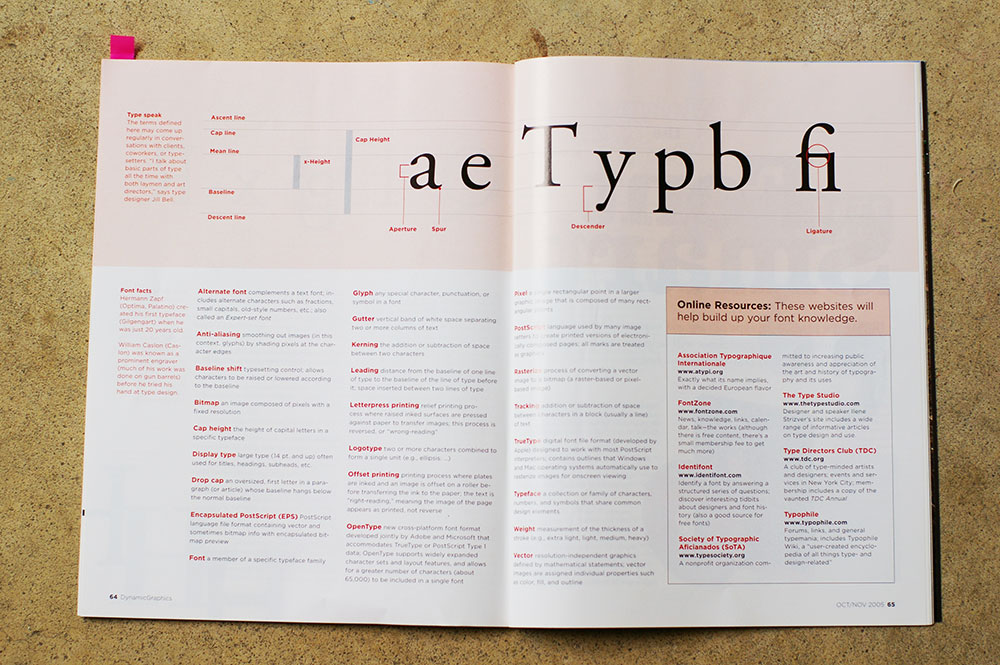
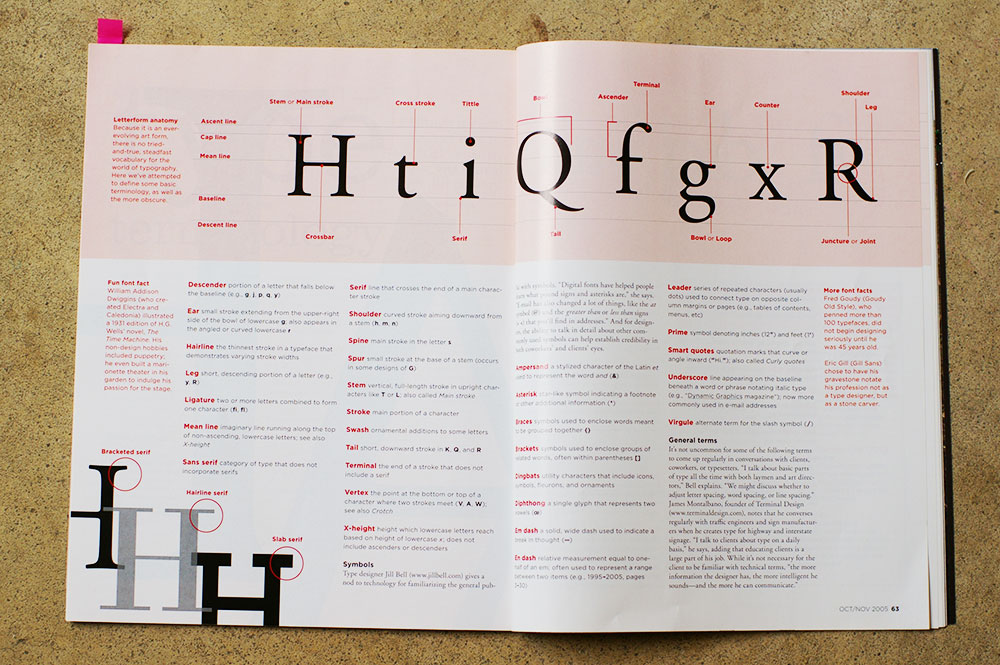
This is all well and good, just don't pretend that this graphic was your own research. This is the EXACT same graphic I recently came across when I was throwing out old magazines... It was the Oct/Nov 2005 issue of Dynamic Graphics on page 62-63. :-p

Seeing as how type anatomy hasn't changed in quite a while, I doubt there are many "original" versions of anatomy charts floating around :)

I rest my case.

Actually there's an even more identical, if that's even possible, image that comes up about 2nd if you google image search "type anatomy." But then, nothing is orginal these days. :-p

As I said. :)

I sympathize.
It's hard to set your moral compass when you see the relativity of standards that are applied to originality/homage/plagiarism, in different areas of digital culture (and countries).

Nitin appears to have swiped the layout, but he has made his own artwork from scratch, changing the font. And as he says, this is a starting point.

That degree of "sufficient change" would be quite acceptable in making a font.

The meaning of plagiarism has not changed, and I think that irrespective of how legal or changed derivative work may be, it never hurts to credit one's sources -- this is a perfect usage for metadata.

http://www.docspopuli.org/articles/RecyclingArt.html

Latest on the Fairey case:

http://paidcontent.org/article/419-judge-in-ap-shepard-fairey-fair-use-s...

That degree of "sufficient change" would be quite acceptable in making a font.

I’m not sure … If sources credited, yes. I think we should expect derived work to bring something new to the table as well (new features that allow different and/or better use).

http://typomil.com/anatomy/index.html

a very comprehensive guide.

Captured from web.archive.org on 12 Oct 2013. view this capture