
This an idea I had some five years ago: water-like script. It has been sleeping for some time, but now I started on it again.
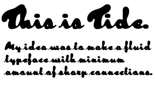
I'm still working on the full character set, so no pdf just yet.
What do you think?
This an idea I had some five years ago: water-like script. It has been sleeping for some time, but now I started on it again.
What do you think?

It's surprisingly readable. I like it.

Gonna be tough at small sizes Tomi... no counters!

Interesting!
Some problem with Th, though.

Looks like a good idea.
The counters of e and s could be a tad larger. I had problems reading "sharp" at first, as s, a and o are very similar, so you need context. Maybe the o would be better off without a connecting stroke to the right.
The spacing of de in "idea" appears too wide to me, but - almost - ok in "Tide".
I can't really imagine how your f is written with a pen.
And maybe the i-dot could have a slant to go with the penstroke.
My 2p.
Andreas
Good points. With this font I'm looking for some edges of readability.
Hi-
Th I fixed, but with 'de' I had no choice, like with all 'e' connections: it's same connection to all lower case characters. With some exeptions.
Captured from web.archive.org on 25 Apr 2015. view this capture