Typophile

Myriad Pro Stylistic Alternative?

Meighan T

I'm working with Myriad Pro for a client- They would like to use that typeface for roman letters, but when making it italic- the a loses its ascender. Is there a stylistic alternative for this to change the a to look like its roman? I've looked through glyphs and can't seem to solve this.
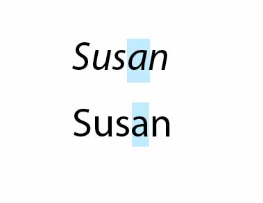
This is a deliberate design decision. Very few fonts have two story a’s in their italics. You could always draw a custom version.

But Frutiger Italic does!

Yeah. I don't actually think that's a good thing. Apparently neither does Frutiger; when he and Kobayashi redrew it as Frutiger Next, they gave it a single-story italic "a."

Meighan, if you were a chef, and a client wanted you to serve vanilla ice cream with ketchup and vinegar to their guests, would you do so? You could point out to your client that most typefaces that have that property are thought of as "oblique" rather than italic, and that most typographers think obliques suck.

T

Captured from web.archive.org on 16 Apr 2015. view this capture