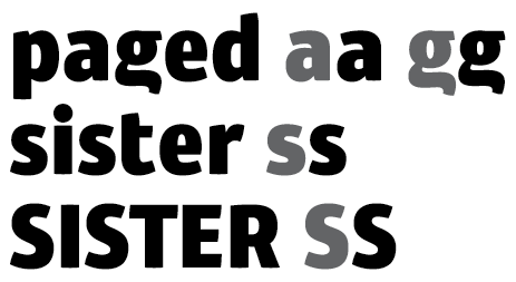
I've been working on this for a few weeks now, and it's about time to get some outside thoughts.
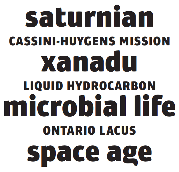
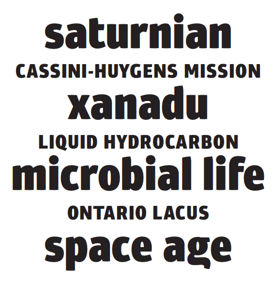
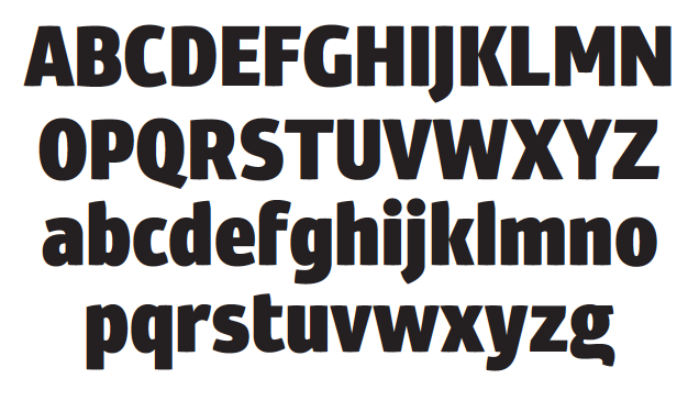
I started off wanting to do something futuristic but classy, but may have strayed from that a bit, which is probably for the best. I see this as more of a headline font, especially in this weight, shooting for sizes 18+. Eventually, I might try to get the lighter weights to work in smaller sizes.
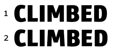
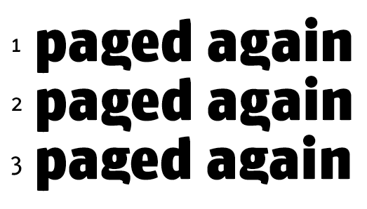
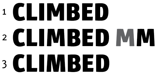
Any thoughts would be greatly appreciated. I think what I'm struggling with most is the widths and proportions of the caps. The semi-double-story g will have to be an alternate, if included at all.
No kerning yet, by the way.
| Attachment | Size |
|---|---|
| salo-5-24.pdf | 472.8 KB |
| salo-5-27.pdf | 92.16 KB |