Hi everybody!
I'm from Bulgaria.
Long time I've wanted to discuss the issue of neglected Cyrillic alphabet.
It's a kind of orphan at the moment. It was developed during the Medieval time in the Bulgarian kingdom. Following very close graphical characteristic of Greek alphabet, together with Latin, the new alphabet become third one from the same family. Alphabet was adopted by many countries, among them the biggest slavonic one - Russian Empire. After Bulgaria was conquered from the Ottoman empire in 15th century the development of this alphabet actually stopped. It was like that until 18th century, when Peter The Great of Russia decided to make some reforms in it. Some letters were disregarded, others emerged, third received graphical changes. Initially good, this Reform somehow made the gap between similar Greek and Latin grow bigger.
Right now, if you look at the font, containing all of the above mentioned alphabets, you can see very strange and obscure things.
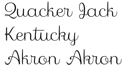
Letters like "K", "k" which even sound alike in all alphabets have in fact different faces. Letters "Ж", "ж" suffers from the same "identity crises". "g", "n", "u" and other regular letters, which, in fact can be similar in latin and cyrillic are intently crated with different face, bringing an inconstancy in the general font characteristic.
My colleagues from Russia are involved in this process, and without any intention to offend them, I want to say that such treatment of the fonts is not making any good for them. On other hand, designers from non cyrillic countries, creating cyrillic fonts are trapped in the same "mistake". My opinion is that the bigger similarity the easier, cleaner and stylish the font will be to read and look, especially when bilingual text are used in the document.
Please, any thoughts?