Hello everybody,
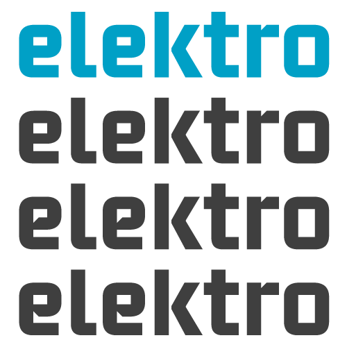
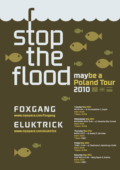
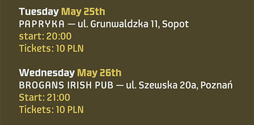
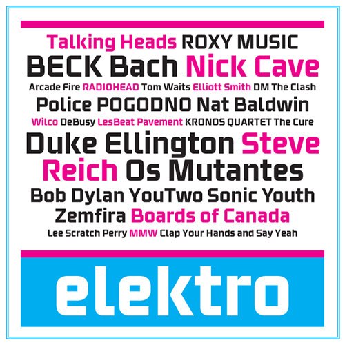
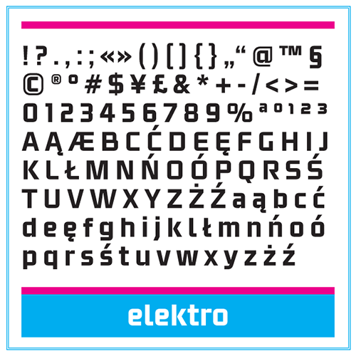
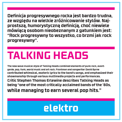
I'm submitting to your critique a display font called Elektro. It began as custom lettering job I did for a friend's band logo. It's inspired by their prog rock music style with a touch of modernist aesthetic. I'm currently working on alternate weights, as well as a matching italic and a slab serif. Any advice on how to improve it is greatly appreciated.
| Attachment | Size |
|---|---|
| elektro_sample_2.pdf | 85.25 KB |