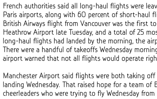
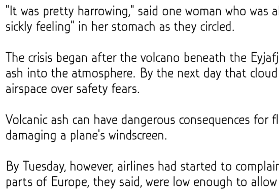
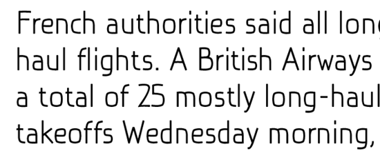
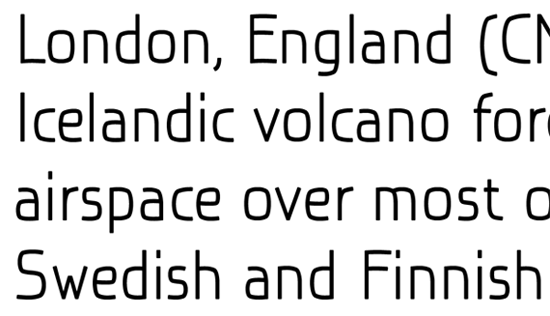
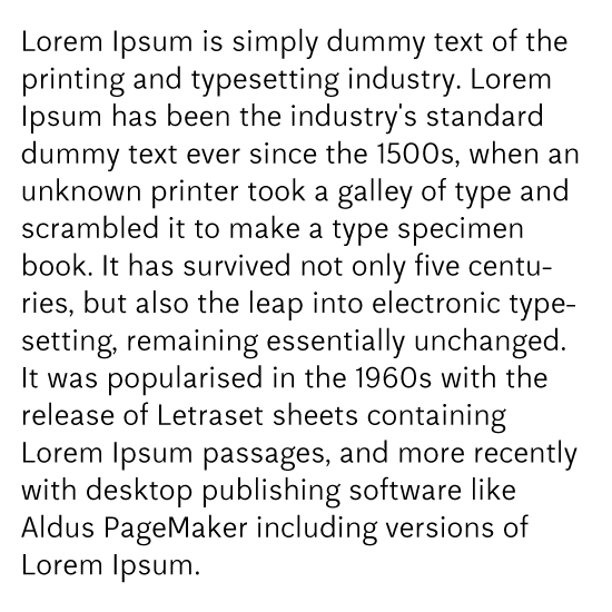
You know the moment when you're becoming pretty unsure if you did a good kerning and no matter how much times you look into the font, you always have some doubts whether if it's good or bad, near to finish - far away from being useful...
That's the moment that holds me last a couple of days with this new font.
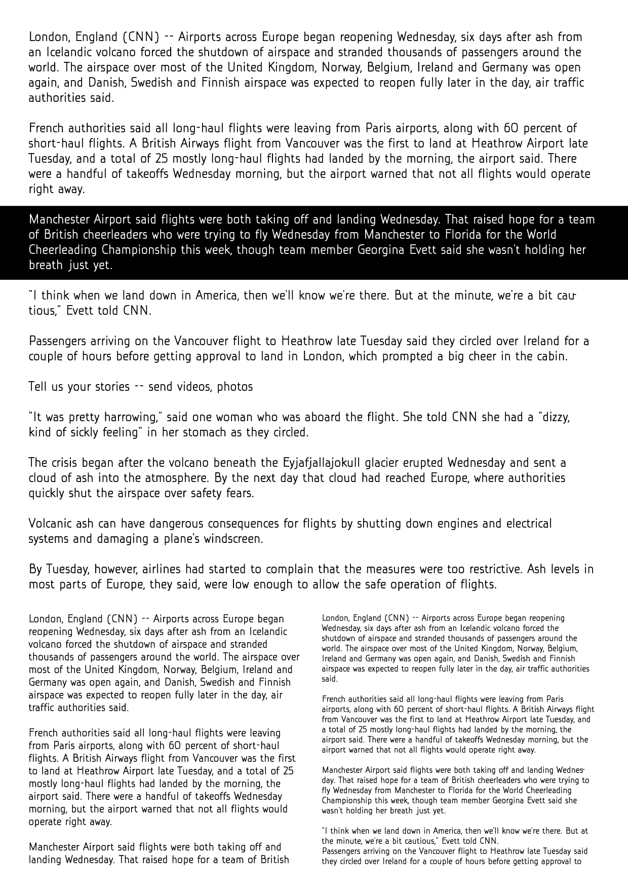
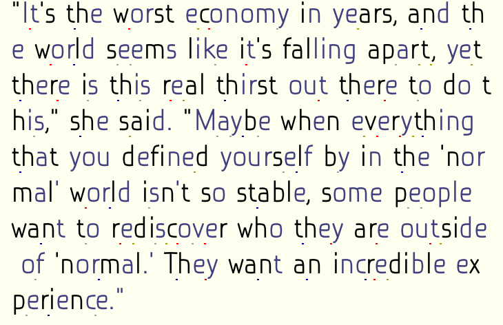
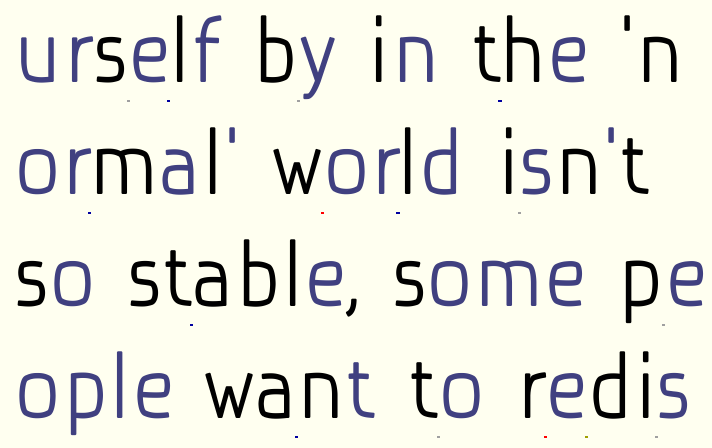
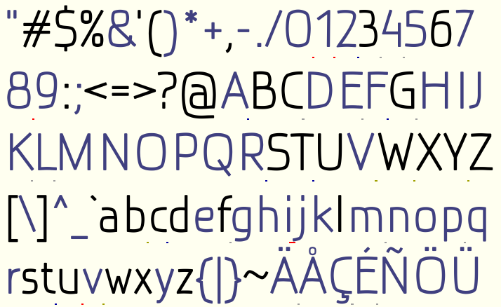
I need some fresh (and refreshed) eyes to take look at this file and tell me if you noticed some irregularities.
I attached some PNGs that can be helpful:

Thanks
- Dusan