
.
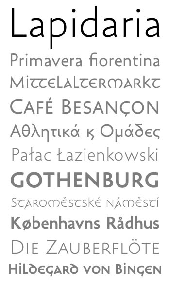
I am about to finalize work on that new sans family.
The special thing is: an uncial variant that matches the upper and lowercase parts.

This looks marvellous, Andreas. Do you think maybe the tittles in the roman is a little high above the ı?

Impressive, Andreas. Not only the unicial and sans interaction, the uppercase looks promising too (the bold "GOTHENBURG").
PS
Hehe, Ster2019s
Or maybe not? That was my first impression seeing “Lapidaria”, and reinforced with the tittle in the uncial.
tittles – you mean the dot of the i? Too high? Hhm.
Hehe, Ster2019s – – Oh dear, oh dear. I finally raised that matter in this thread, hoping for some progress.
marvellous, impressive
– Thank you, gentlemen.
It is, I’m afraid ;-)
I will never have to touch Futura again.
NEVER.
.


Looks good; I like the idea of an accompanying uncial.
Check the kerning around 'v' ("Primavera")
the kerning around 'v'
oh yes. Maybe, the v is still a bit too wide …
yes, the /v/ and the /w/ could both be narrowed a bit. Some spacing problems show up in "nkowski" too.
Captured from web.archive.org on 13 Oct 2013. view this capture