
Hi, a week ago, traffic authorities of Prague changed the signs in one metro station in Prague. Can anyone identify the typeface they used? Thanks.
Images are online:
Hi, a week ago, traffic authorities of Prague changed the signs in one metro station in Prague. Can anyone identify the typeface they used? Thanks.
Images are online:

In Warsaw streets-signs are set in Frutiger.
Maybe in Prague they use Frutiger also :o)
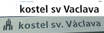

Myriad?
It is definitely not Frutiger, although the proportions are similar, the shapes are different. It is not Myriad - check the digits or diacritics.

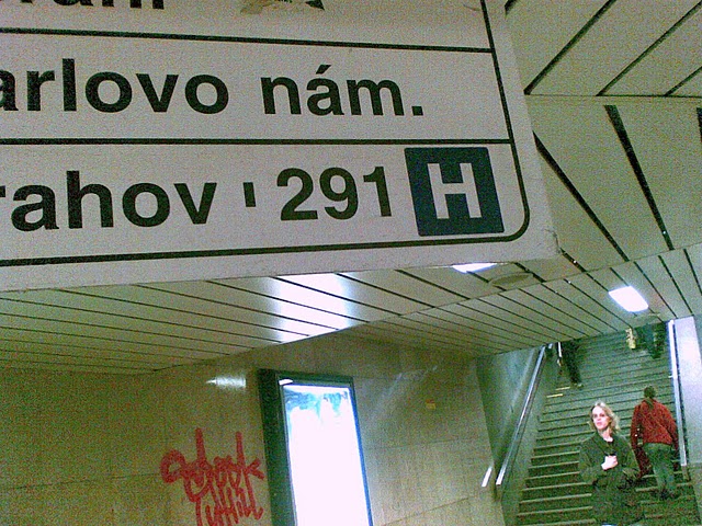
Some of the images show something pretty Helvetica-ish.

I'll bet the Frutiger look-a-like is FF Transit (see FF Transit)
Thanks, riccard0, but this is the old signage. Barthak is right, the font is very close to FF Transit, but the digits are different and several letters have softer shapes. Maybe it is a custom typeface.
I'll bet the Frutiger look-a-like is FF Transit (see FF Transit)
Wrong y:
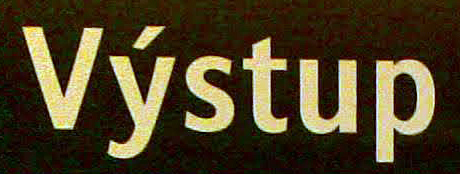
Then I'll vote for custom too.

It looks very like Stroudley by Dalton Maag. The 1 with feet is a giveaway.
Thanks, typofoto, it must be Stroudley. There are too many similarities.
You're welcome. It's a great picture set, I love this arrow: http://picasaweb.google.com/pavel.farkas/KarlovoNamesti#5469716811985903090
It seems the authorities are testing the proposed design in a real environment. The Transport Company is silent about it, which is understandable. If the public would be allowed to discuss it, the vox populi would say: keep the old signage, we like it, it is good. I guess that's why they picked one of the less frequent stop in downtown for the experiment.
I am looking forward for the change as the signage today is rather bad and inconsistent. I hope all the bugs will be solved and Prague metro won't be a shame compared to other European cities.
Captured from web.archive.org on 14 Oct 2013. view this capture