
In a business card setting, is it ok/preferrable to hang the plus? I've never seen it done before, but I don't like how the non-hanging plus breaks the flow. Or is the hanging plus too disturbing?
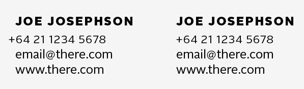
In a business card setting, is it ok/preferrable to hang the plus? I've never seen it done before, but I don't like how the non-hanging plus breaks the flow. Or is the hanging plus too disturbing?

In your examples the thing I find most distracting is the lightness of the numbers compared with the e-mail and website type.
That said, unless it's carefully placed inside the overall design, I find it's mostly distracting.
As an alternative, you could align the text right.

If the phone number is the crucial information and if you pushed the plus sign even a little further and gave it a colour maybe.
But I think a plus sign has a soul and should be treated like a letter. I say that because unlike an apostrophe or a hyphen it actually consumes almost as much ink as a lowercase o. If you want to optically adjust it you may want to align the vertical to the beginning of the line, but even that may look odd.
E is too far from the O, HS is too close together compared to the surrounding P and O.

I prefer the one on the right, but would be interested to see how a middle way looks.
The lowercase lines look a little cramped in terms of letterspace and leading.

Bugger all: the hanging plus sign works for me...
You know you could be right after all. That hanging one is really growing on me.

I'm with oldnick, I usually opt for hanging punctuation. It's a sign of the careful, detail-oriented typographer.
No a plus sign is not punctuation hahaha, like I said it has a soul!
Okay what about a Spanish question mark? :D
Perhaps it is a little too bold of a move. Maybe it works best with just a slight overshoot like in the first one below. Much further and it starts to get wonky.
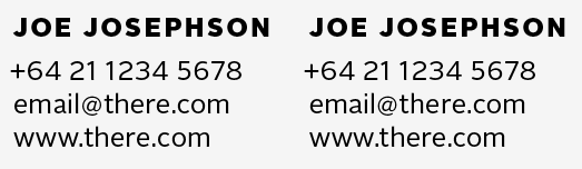
the thing I find most distracting is the lightness of the numbers
Agreed, the numbers seemed gigantic, so I shrunk them a point, but the difference in weight is a bit much.
E is too far from the O, HS is too close together compared to the surrounding P and O.
Yeah I haven’t done any kerning on this, as I didn’t want to give out the client’s real name and contact info.
I'm not really a fan of the half-in/half-out, deal... looks more like an accident. I say go for it. Be bold.
No a plus sign is not punctuation hahaha, like I said it has a soul!
It's more punctuation than letter. It's not really used in sentences... usually only comes up when numerals are involved. Either way, I wasn't necessarily calling it punctuation, it's just easier to call it "hanging punctuation" (as that's what it's called) as opposed to "hanging plus." Also, what you're saying is that punctuation doesn't have soul, which is also completely incorrect. :)

The hanging plus works for me!
The J in the first row of your example makes it somewhat hard though to discuss the concept of hanging plusses in general.

'In a business card setting, is it ok/preferrable to hang the plus? I've never seen it done before'
You won't, because the plus sign imparts important information: it means 'substitute your national code for dialling foreign telephone numbers here'. It's not a punctuation mark, and it mustn't be overlooked.

Glad you posted this.
In addition to the above comments, I would suggest not altering the size of the “@” symbol. Here, it looks disproportionate to the rest of the text. However, if you plan on adjusting for stroke thickness then by all means give it a try—print samples to test reader cognition.
Also, if you intend to have the telephone number larger than the web and email addresses, I would enlarge it more so that it looks like you intended to be larger, as opposed to have enlarging it with point sizes too subtly to each other and the reader (or casual glancer) may not get the impression the the telephone is being emphasized over the web addresses.
Let us know what you come up with.
Mike :-)
Michael Rowley expressed my idea about 'why the plus sign here is more significant than punctuation' more seriously.
But also said "I've never seen it done before" well that's not a bad thing necessarily.
I still think it's editorially wrong to hang it but who cares.
3/4 numerals make more sense than cap height ones. Like fabulous said don't hesitate to add a tiny bit of stroke to compensate the change of weight. If your working in InDesign you can set a Character Style that scales type 75% and then adds a 0.05pt stroke. And then add a GREP in your Paragraph Style that applies you Character Style to "Digits".
Regarding the @ symbol it is totally replaceable, as long as you find one from another font that matches your typeface.
Thanks everyone, also for the stroke/lightness tips.
I think I’m going to go with the non-hanging one. The more I look at it, the less it makes sense to hang it. Perhaps a bit too much of a sacrifice just for the flow of the column.

Normally, the plus sign would not hang off the margins. In the case of its use in telephone numbers in some countries, however, the way in which it is used may give it a meaning that makes it appropriate to treat it as hanging punctuation.
Captured from web.archive.org on 13 Oct 2013. view this capture