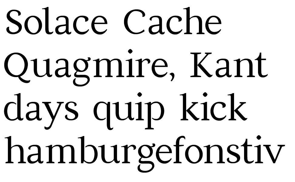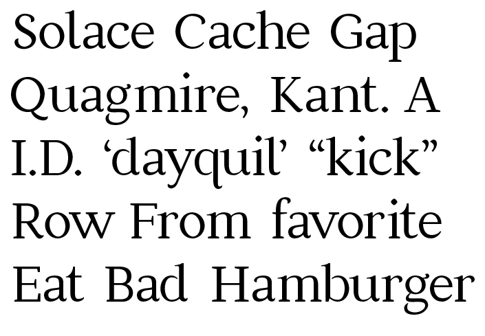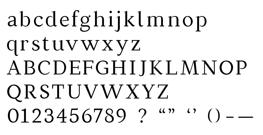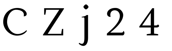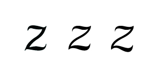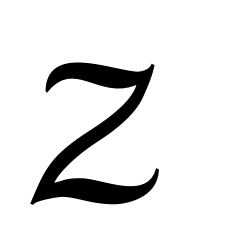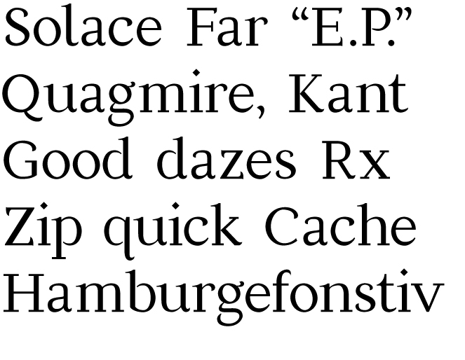
I'm working on my first serif face. I feel like I've got a pretty good start on defining the identity of the typeface, but I'm trying to work out the inconsistencies of it now and any letterform awkwardness. Any suggestions?
| Attachment | Size |
|---|---|
| test_serif.pdf | 67.33 KB |