Hi everybody,
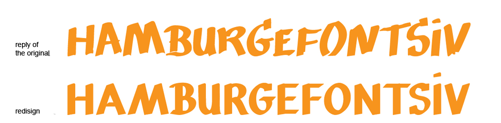
I'm a student of master in graphic design and I'm building a new typeface. It's a remake of a hand lettering. The original draw was made by a Oporto's seller.
Here is http://typophile.com/files/hamburg.jpg
I'm showing here for ask your contribution and opinion. I have many doubts about how I can adapt the original design for new caracters. Can anyone help me?
Please, say what do you think about. Sugestions and critics are welcome.
Thanks.