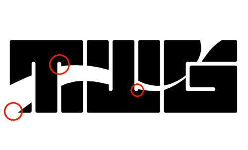
Hey fellow Typophiles! This is my first post here, as well as my first logo. I would love your input on it!
I have two versions, a black and white one for purposes of evaluating form (of the utmost importance), and one that puts the logo on a simple background with a slight drop shadow (just for fun). Please let me know the following:
First impressions
Readability
What comes to mind when looking at it
How it reads
If it is directly infringing on anything (I hope not)
Recommendations, critiques, ideas
And so here they are:
Form:

Just for fun:

Also it should be noted that I will be integrating the word GRIFFIN underneath the logo. I'm thinking of designing my own font to keep it in keeping with the logo, but if you have any suggestions for typesets that would be awesome! Thanks!