Hello
First and foremost, forgive me for my relatively bad English.
I really love this forum. I've learned so much in here. I'm an educated graphic designer, but type in logos are my biggest challenge. I know how much it means to have the right font, spacing and more...
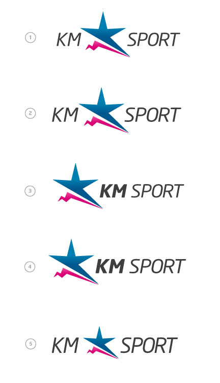
Can you help me with the font/spacing/lettering on this one??
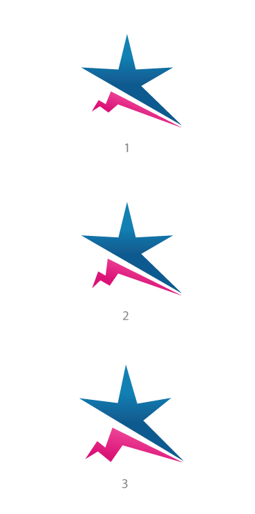
And what do you think: The first (with round corners) or the last with hard lines???
File is attached...
Thank you in advance...
| Attachment | Size |
|---|---|
| logo ny-06-07.jpg | 319.84 KB |