
the attached image shows the cover type on the current edition of "der spiegel", a german magazine. it's an article about apple so it should be myriad, but it isn't. any ideas? i really like these letters ...
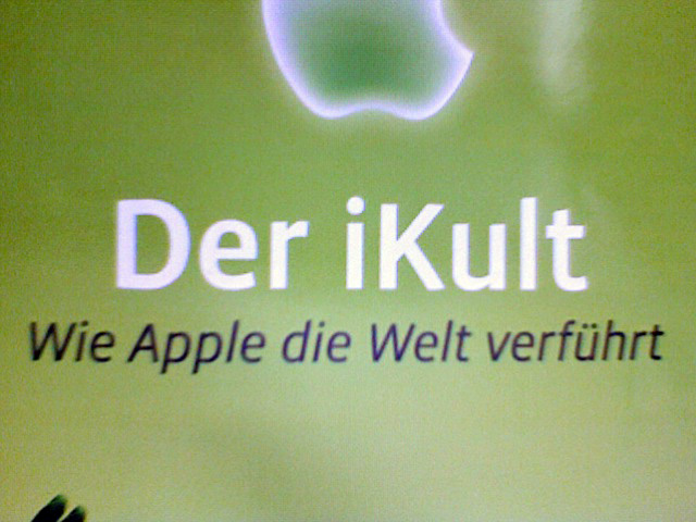
the attached image shows the cover type on the current edition of "der spiegel", a german magazine. it's an article about apple so it should be myriad, but it isn't. any ideas? i really like these letters ...

Isn’t that one of Spiegel’s custom typefaces?
(It only should be Myriad if this was an Apple ad. Independent journalism should use what they want.)
It’s not Spiegel Sans.

Vista Sans, medium weight. I think the italic is book weight.
Thank you microspective, that's it! The letters on the cover look quite straight but when you see the whole typeface, there are some quite unconventional forms, especially the small "a" and "g". I would not have expected the rest of the alphabet to look like that ...
Sure thing. I use Vista in my company logo (and the avatar to the left is a custom form of Vista's m). Don't sound so disappointed about the other forms! The OpenType fonts have a handful of alternates. It's a pretty versatile face. Enjoy!
Captured from web.archive.org on 22 Aug 2013. view this capture