Hello,
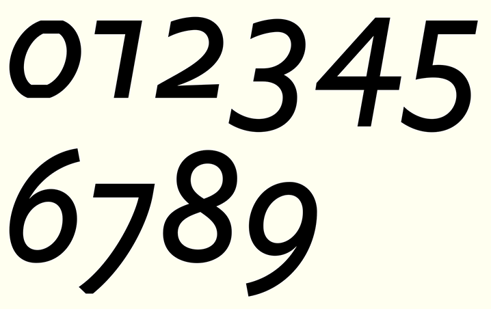
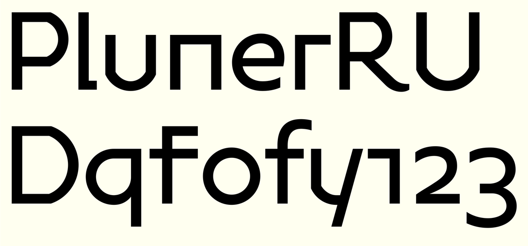
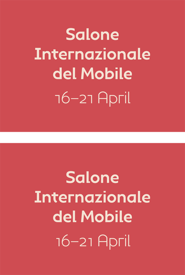
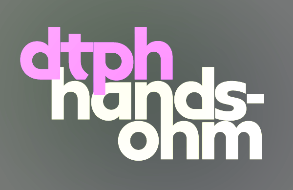
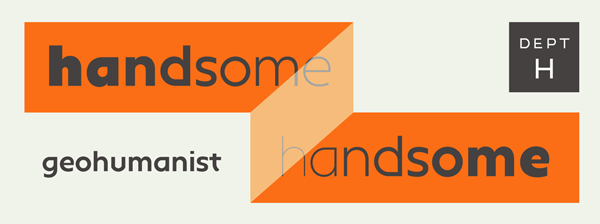
this is my first post here. I am hoping to get some feedback on a type family I have been working on. It's called Handsome, it has nine weights, small caps and italics. I think I may redraw the italic numerals as they are slanted roman at present…
anyway it would be good to get a response! Thanks very much.
http://www.dept-h.co.uk/index.php?/fonts/handsome/
| Attachment | Size |
|---|---|
| Handsome-typophile.gif | 18.1 KB |
| DPTH_HandsomeTextWeights.pdf | 64.19 KB |