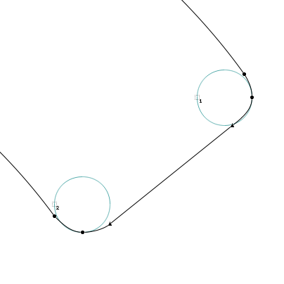
I'd like to try to soften a little a typeface I'm working on by making its corners round (like those of ShinnType's Figgins Sans, for instance).
The obvious way would be to use FontLab's bold effect: first "bold" it by –X%, then bold it by X% making round corners.
Two questions –
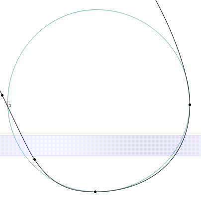
First, would you consider the result of such a procedure generally satisfactory? I'm getting the feeling that perfect contours become much less than perfect this way, requiring tedious cleanup, even for relatively small values of X. But maybe I care too much over tiny details that nobody cares about? What would you do?
Second, if I do it this way, then all resulting arcs have the same radius, regardless of the corner's angle. Is it not preferable that greater angles would be replaced by arcs with greater radii, so all would look softened by the same amount?