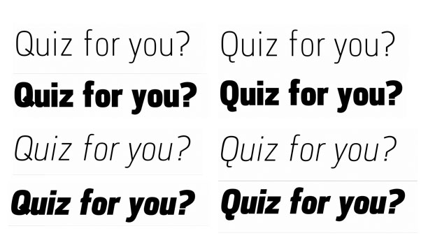
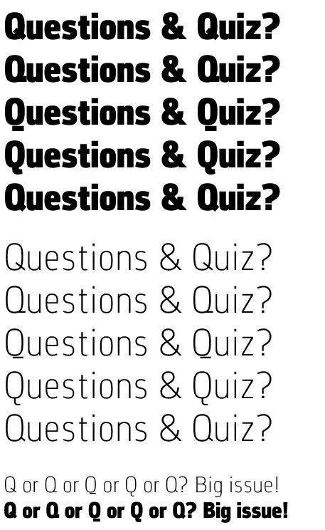
I start a new squarish sans serif — named “Corbeau”— and the Q give me some hard time There may be other letters that would need attention, but for now I am concentrating on the Q. I wonder which one should be better, the one with the oblique line or the on with the curve? Or, which one fits the best with the other letters. Your advice will be very useful. Thank you in advance.
André
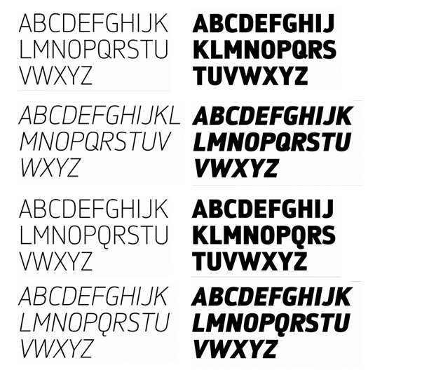
Other sample