Hello together!
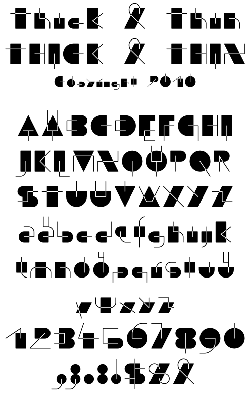
I would like to get some crits on my new "Thick & Thin"-Font. It is relatively experimental and readability seems to be limited. I think the construction rules are quite obvious: Each letter consists of one "thick" simple shape and one thin line.
The font is not yet finished, some symbols are missing and I'm not happy with some letters.
| Attachment | Size |
|---|---|
| Thick&Thin.pdf | 58.77 KB |
| thick&thin.png | 44.79 KB |