Dear Typophiles,
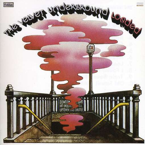
I'm designing an events programme for a youth arts centre. I'd like the subtitles on the cover to project three dimensionally as attached but there's something about it that doesn't quite work... is the contrast between the different shades too great? Are the titles too long for this sort of treatment? Is it simply because the font isn't designed to be used this way?
Could anyone suggest a similar but more suitable font or recommend examples of 3D type I can refer to? I've used Helvetica Neue Black Condensed because it is within the corporate identity guidelines but have some leeway to introduce a new font if necessary.
Any thoughts would be much appreciated.
Many thanks,
R