
Any comments on this draft of a new Greek lowercase sans alphabet highly appreciated.
Regards, A. St.
.
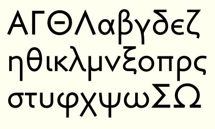
Any comments on this draft of a new Greek lowercase sans alphabet highly appreciated.
Regards, A. St.
.

It's actually pretty beautiful. Could you upload a text sample it possible?
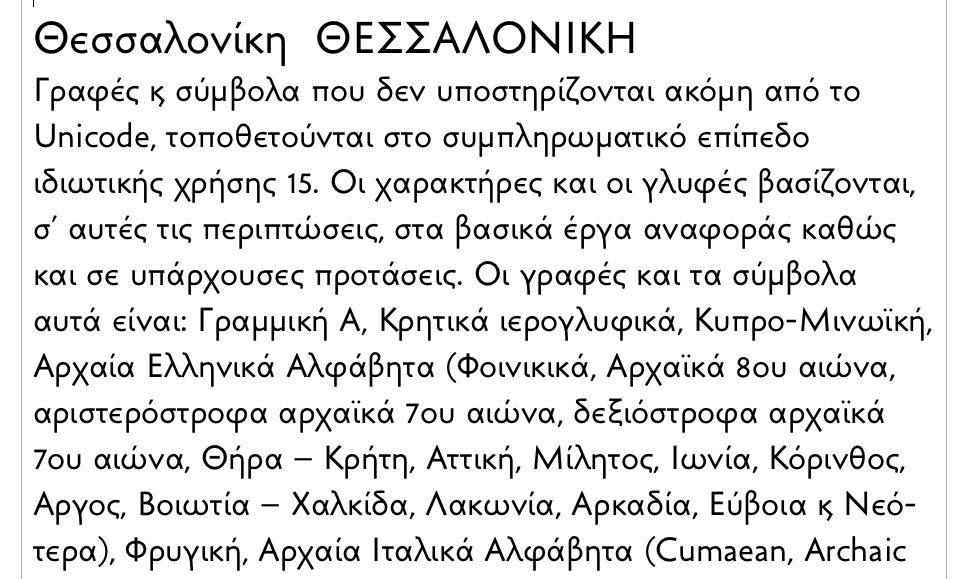
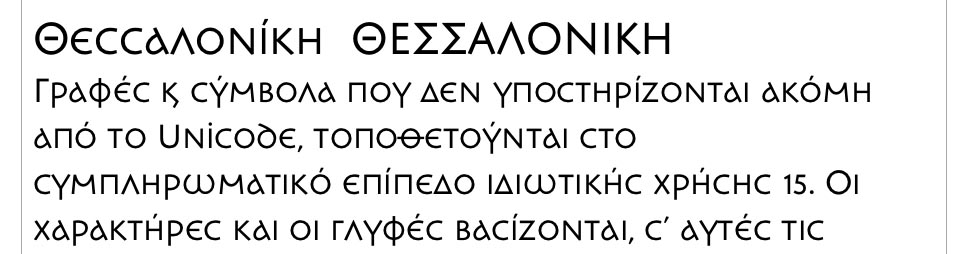

It is quite nice, I like it very much.
The second delta does look better and balances beautifully on top. The right hand side of mu and pi would look better if done like the lower part of iota. Lowercase nu could look like the upper part of gamma. The lowercase lambda doesn't actually need these curls on top and bottom as it should be harmonious to nu, chi and gamma. There is more if you want but I hesitate just in case that overdo it.
Captured from web.archive.org on 15 Apr 2015. view this capture