Typophile

New high end, high quality futuristic typefaces

Troy

Hi all,

I've always been a big fan of the futuristic nasa/terminator styled type of fonts, with probably my all time favorite being WTF New Strike, which has become more main stream of late and I am now looking to find some new high end, high quality typefaces in this kind of style.

Anything that gives a futuristic / technology feel.

Unfortunately New Strike was created and held at http://www.twice2.ch/news2.htm
but they no longer promote the fonts they created.

Something similar to it is http://www.dafont.com/font.php?file=sevil_alias_esra_li

But obviously being a free font it doesn't quite have the quality finish that New Strike has.

Any help would be great

Check out my Board of Directors font at MyFonts next week. Also Uniwars & Korataki.

Matt McInerney's Orbitron is fairly new and is free from The League of Movable Type.

This raises the question of what constitutes "futuristic" in this modern age. Is it still the squared-sans, variants of which have been popular since the 1960s, or is there an emerging trend with less connection to the past?

These are all examples of Post-Retro-Futurism if you ask me.

I always thought ITC Orbon had that certain futuristic je ne sais quoi. Even if I do say so myself. Although when I designed it I was heavily influenced by that Post-Retro-Futurism thing.

Futurism is now inherently retro. It is nostalgia for a time when humanity seriously thought about the future and wanted to make it happen.

It’s not a typeface, but a lot of the visuals Amon Tobin uses is geometric futuristic in a very interesting way. See this logo and this later version.

Here’s something quite retro-futuristic I’ve been admiring as well (from Madlib and MF Doom’s Madvillany record).

The future has always been retro. Nothing has happened recently to change that.

>The future has always been retro

And as if we need proof, I nominate the most successful futuristic font of ALL TIME!

Cheers!

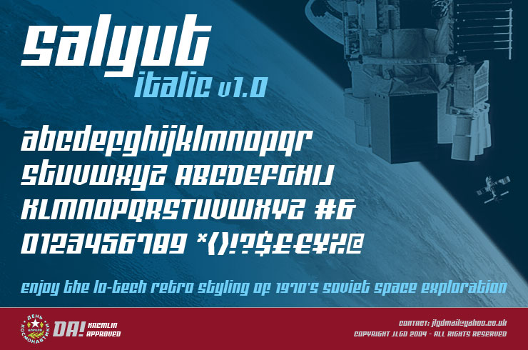
This thread reminds me of Salyut Italic and the type specimen I created for it a long time ago in a galaxy far, far away (2004). It was the first type design for which I produced a finished font file with a complete set of glyphs. If anyone wants the TTF file for nowt, just message me.

Futuristic fonts: ones that don't need hinting, because all media resolution will be so fine.
Ones that are financed by micro-payment.
Ones that are interactive with the reader.
Ones that are interactive with the environment.
Ones that support colour and tone.
Ones that are animated.

Mostly this futurism is new technology, not much about the look.
But new technologies enable new looks.

Tim,

Biome was designed in a spirit of retro-futurism. The family includes seven weights and alternates to dial up or down the degree of "futurism". A full character set supports most European languages and includes ligatures, small caps and various figure styles.

Hey Nick, your font browser is superb!

Thanks Owen.
Due credit to Aleksey Liskovsky.

That's a great site. It loads quickly and looks really different. Thanks for the link.

I think what we're discussing in this thread are techno fonts. Techno fonts grew up alongside high tech electronics and industrial equipment. It's a term that's less likely to show its age than futuristic. 10,000 years from now, the technological revolution will still be traced back to the late 20th century. Whereas the term futuristic will always be vague.

Futureman: "What do you mean futuristic? Like 8060's futuristic or more of a 9040's look?"

When I classifying techno I think it's important to define the distinction between industrial and techno. It's similar to the difference between hard rock and metal. Many consider the first metal album to be Judas Priest's British Steel. Judas Priest deliberately shed all blues influences from rock and the metal line was drawn. <-read aloud in a booming voice. Techno fonts deliberately shed art deco influences. I think the original techno font was Microgramma. It has mechanical, industrial forms but deliberately kicks off all Art Deco leanings: no crossbars that pass through the stem, varying crossbars. From that point in time, you can trace the lines of indostrial and techno. The industrial line continued through the 1950 and died in the early 1960s. Think of the joined line automotive scripts, gas pipe square fonts with aligned crossbars and Huxley. By the 1960s industrial was out of fashion. The techno line didn't expand much until the 1970s. Between Microgramma, Stop, Data '70 and Handel Gothic, there wasn't much happening. When I look at an early 1970s Photo Lettering catalog or there's not much that I'd classify as techno. Many of the square fonts were too cute or expressive to be techno. In the 1970s you had Japanese companies using techno style for logo design, particularly for electronics. The industrial style was old fashioned and would have looked out of place with high tech electronics. That's around the time of the Nasa worm logo (1975), Digital Sans, China etc. Around 1990s, industrial made a retro comeback with fonts like Industria and Bodega. At the same time the Designer Republic was bringing back early techno.

I hate to see techno thrown into the futuristic basket. Let's just leave Futura, Bayer and a few others in that one.

I would suggest the excellent Allumi PTF by Jean-François Porchez.

Thanks for all the posts guys, my search continues however as I havent found one that really grabs me for what I am looking for as yet. Typodermic your notes on the catagory Techno are noted, that makes sense.

One techno style that I did come across however is shown on this thread
http://typophile.com/node/70005
I haven't been able to find an image of what I am talking about, but think techno/alien/scifi and throw in a bit of roundness of the new Tron logo.

I'll try and dig this thing up from some where.
If I could find a back cataloge of all previously created diesel shirts I would be set to find it!


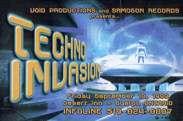
You might remember this face, Ray!

**


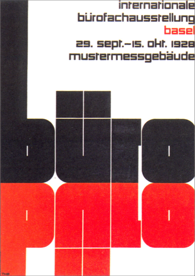
A 1928 poster by Theo Ballmer.
It's 127 cm x 90.4 cm, and all the lettering is razor sharp and perfect, even at close inspection.

wow Nick so they were doing Techno back in 1928!?!

Whoa. It still looks like the future.

Captured from web.archive.org on 23 Jan 2015. view this capture