
Hello!
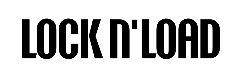
This is a logotype I drew for a video production company. To soften a little the geometric look, I drew the L with a diagonal ending stroke and the K with the chevron disconnected from the stem. The N is a lowercase.
Hello!
This is a logotype I drew for a video production company. To soften a little the geometric look, I drew the L with a diagonal ending stroke and the K with the chevron disconnected from the stem. The N is a lowercase.
Of course, critiques are welcomed.

Hi Boros,
I know this is a logo and probably a registered name, but shouldn't it be "LOCK'N'LOAD", with an extra apostrophe before /n/?
Yes, you are right. But me and the client feared it would crowd things too much. Honestly, in choosing the position of the single apostrophe, I checked where Guns n' Roses put theirs.
Nevertheless, it just crossed my mind that I haven't even tried to use two apostrophes to see how it looks. Will do that, thanks.
On a more practial note, I think that the chevron of /k/ is centered too high. Try lowering it a bit and at the same time move the upper right diagonal further to the right. /c/ and /a/ feel too wide compared to /o/, /d/ a fraction too narrow.
Perhaps it's a good idea to repeat the diagonal like you have on /L/ in the apostrophe(s)?
I've widened the O and the D. Is the O too wide now, perhaps? The apostrophe I think looks better angled. Overall, I think the readability has improved.
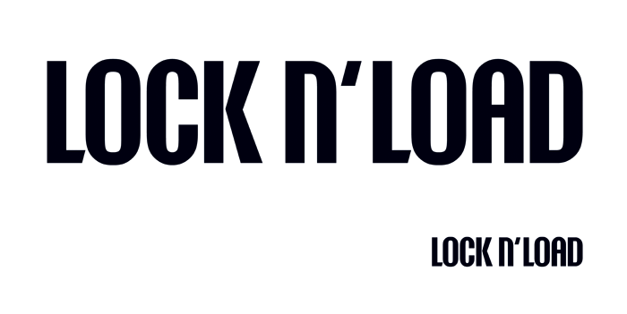
I miss the high waist of the K's chevron. I think it lends elegance to the logotype if set higher above the center, like this:
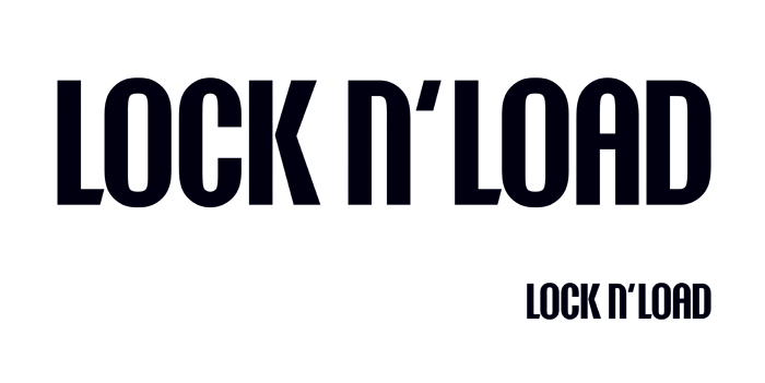

Because they are sheared and they haven't had the same widening as other characters, your /L/s now look rather weak. Maybe you should try thickening their horizontals. It might also be the case that your overshoot on the curves is a bit too much top and bottom.
I'd sure vote for two apostrophes. For correctness, and because with just the one, it looks a bit like "N'LOAD" is one word (like "O'Neill or "D'Arby").

Agree with ^ on L looking weak. Its horizontal is definitely too thin, and it sticks out visually.
Have you tried incorporating the apostrophe into the L, i.e. merging them in a single symbol?
Another thought - perhaps cut the height of N in half and take the apostrophe out?

How about sticking with the original, and just cramp things up. Make a single word-image rather than two and a half words?
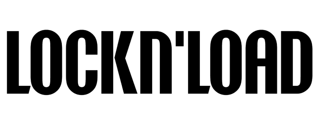
I see what you say about the L. I also feel the O is too wide now. Also, in the very first example, at the top, the narrower counter of the O hides better the baseline overshoot. I will try a compromise - narrowing a little the O and bringing it's height closer to the cap height while decreasing the angle on the L ending and/or thickening the horizontal.
Apankrat, I've experimented with other n heights or shapes - to get rid of the apostrophes altogether - but a smaller n brings too much complication to the design.
Useful thoughts, thank you!
To Tomi from Suomi: here in Romania the phrase "Lock and Load" is quite unknown. Even if the audience of this logo - people in the film business - speaks English fluently, the syntagma is, nevertheless, unusual to them. Therefore I fear it would lose precious legibility if treated as one word.
Sebastian-
I do not think any Romanians with impared English really see any difference, and my quess is that you are looking for international clientel.
Compacting just reduces lenght to width -ratio. And you are making a logo, not a name of the company. Legally that needs to be somewhere in your A4 anyway.
May your mouth be golden, Tomi, and LNL becomes an international success! But now they are just friends of mine offering their services to local ad agencies and the like. Mostly their logo will be advertised on banners at events and filming locations. I think they'll need their logo displayed clearly for potential clients to make a connection with the verbal name if they hear it afterward, when the LNL sales person gives them a call.
I know that in the end the logotype is perceived and recognized as a shape rather than as words, but this takes lots of exposure and $.
On second thought, you may be right. A two-line book face solution may be more readable than my take on this condensed sans, but it's the distinct shape that I'm after so I already made that compromise. Why not unify this shape?
Captured from web.archive.org on 14 Apr 2015. view this capture