
Hello again-
This is Telltale, a study of low contrast in serif style. Once again it is fairly narrow to work in Finnish language (ääliö älä lyö, ööliä läikkyy, senkin sikaniskainen kaupunkiinmuuttajapaskiainen). I tried to make it low in contrast without making it look fat.
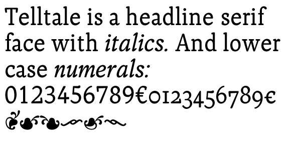
Italics are under production, so samples in pdf are somewhat random.
Any comments?
| Attachment | Size |
|---|---|
| Telltale.pdf | 170.05 KB |
| Telltale2.pdf | 182.56 KB |

